Mistakes to Avoid When Creating a Parisian Vintage Interior
The Parisian interior is one of the most widely referenced and most frequently misunderstood aesthetic categories in interior design. Its visual qualities are clear and recognisable: warm, layered, slightly spare, accumulated rather than composed, with a specific quality of patina and age that no amount of new reproduction can replicate. But the errors made in attempting to recreate this aesthetic are equally consistent — and surprisingly specific. The same mistakes appear in room after room, across different budgets, different countries, and different starting points.
This article describes the most common of those mistakes in direct, practical terms: what the mistake looks like, why it happens, and what to do instead. It is not a list of rules. It is a set of observations about what consistently does not work, drawn from the gap between rooms that aspire to the Parisian aesthetic and rooms that actually achieve it.
All observations here are based on what is directly visible and verifiable in documented Parisian interiors. No aesthetic judgement is presented as historical fact, and no specific product is criticised by name.
#1. Mistake: Bright White Walls
The most immediately identifiable departure from the Parisian aesthetic is the choice of bright white walls. This is the single most common error in rooms that aspire to the Parisian look, and it is the one that most consistently undermines everything else in the space.
Bright white — the cool, high-reflectance white of standard decorating paint, particularly in satin or eggshell finishes — produces a wall surface that fights the warm palette and aged materials of a Parisian interior at every point. Aged brass reads cool against a bright white wall. Natural linen reads grey. An antique kilim loses its warmth. The foxed glass of an old mirror reflects a sharp, cold light rather than a warm, diffuse one. Every material choice made in the Parisian direction is undermined by the wall behind it.
The correct wall surface for a Parisian interior is warm in undertone (slightly yellowish or pinkish rather than blue-grey), low in sheen (flat or dead-flat rather than satin or eggshell), and ideally with a slight softness of surface — the quality of aged plaster rather than a fresh, smooth application. This does not require an expensive paint; it requires the right tone and finish.
What to do instead
Select an off-white with warm undertones rather than cool. Hold any paint chip against a piece of natural linen or an aged wooden surface: if the white reads as warm beside these materials, it is correct. If it reads as cool or slightly blue, it will fight the room rather than support it. Flat paint is the correct finish for walls in a Parisian interior; eggshell and satin are more practical but visually incorrect for this aesthetic.
→ The complete guide to the colour palette that works in a Parisian vintage interior — specific tones and undertones: → The Art of Layering Textures in a Parisian Interior
| → Farrow & Ball Estate Emulsion — Warm Off-White and Muted Tones |
| Farrow & Ball’s Estate Emulsion range is a flat-finish paint with a characteristically deep, chalky surface quality. The most relevant tones for correcting the bright-white wall mistake: Pointing (warm off-white with ochre undertones), All White (the warmest of their whites, with a slight yellow cast that reads as off-white rather than white in natural light), String (warm stone), and Elephant’s Breath (warm grey-brown). Available in 2.5-litre and 5-litre tins. No affiliate relationship — included because it is the most widely available reference for the specific surface quality and undertone described above. From approx. €55 per 2.5-litre tin · Via Farrow & Ball Editorial note: Use as a reference for undertone and finish even if the price point is beyond the immediate budget. The warm off-white tones in this range demonstrate exactly the wall quality that a Parisian interior requires. Find a match in a more accessible range using the Farrow & Ball chip as the reference. |
#2. Mistake: Matching Sets
The second most consistent error in rooms aspiring to the Parisian aesthetic is the use of matching sets: furniture purchased as a coordinated range, accessories bought as a complete collection, frames that are all the same size and finish, cushions that are identical in fabric and tone. The Parisian interior does not contain matching sets. It contains individually chosen pieces that are in dialogue with each other — related but not identical.
The visual effect of matching sets is that the room reads as recently purchased rather than accumulated. Every element clearly arrived at the same time, from the same source. The result has a uniform newness that is the opposite of the Parisian aesthetic, however beautiful the individual pieces might be.
Why matching sets happen
Matching sets are the default offering of most high-street furniture and homeware retailers, where they are presented as complete solutions: buy the sofa and the matching armchair; buy the five-piece bedroom set; buy the three-piece console accessory collection. This is a convenient and visually coherent retail format that produces rooms that look assembled rather than accumulated. There is nothing wrong with it on its own terms — it simply does not produce the Parisian result.
What to do instead
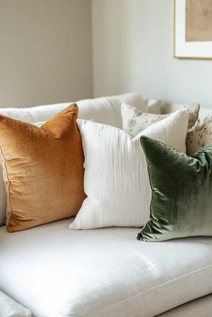
Introduce variation deliberately. If the sofa is in linen, the armchair should be in a different material — velvet, or a different weight of linen in a slightly different tone. If the cushions are all in natural linen, add one in a faded velvet or a worn vintage fabric that interrupts the uniformity. If the frames on the wall are all the same, introduce one in a different material or leave one piece unframed.
The practical approach: when adding any new piece to a room, ask whether it matches something already there. If it matches exactly, consider whether a slightly different piece — same category, different material or tone — would serve better. The room improves through variety; it does not improve through uniformity.
→ The practical guide to mixing old and new — how to combine pieces from different sources and periods without matching them: → How to Mix Old and New in a Parisian-Style Home
| ➶ Vintage French Fabric Cushion Covers — Etsy Specialist Sellers |
| A curated search for vintage and antique French fabric cushion covers on Etsy — the most direct source for the non-matching, varied-textile cushion layer that interrupts the uniformity of a matching set. The search covers covers made from antique grain sacks, monogrammed linen, vintage ticking fabric, old French cotton, and repurposed period textiles. Each piece is unique; buying two or three from different sellers produces exactly the varied provenance that the Parisian cushion arrangement requires. Filter by fabric type (linen, ticking, grain sack) and by size (45 × 45 cm or 50 × 50 cm) for the most practical results. €18 – €65 per cover · Via Etsy Editorial note: Buy covers from two or three different sellers rather than multiple covers from the same listing. The variation in fabric origin, age, and tone is the quality you are paying for — it is the opposite of a matching set, and it produces the specific accumulated quality of a Parisian sofa surface. |
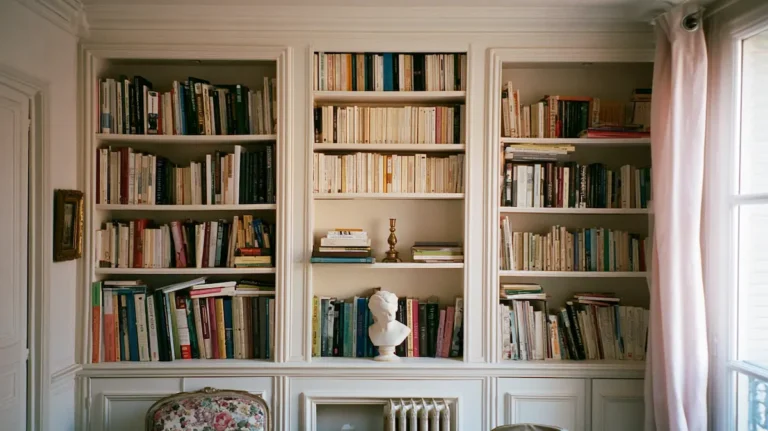
#3. Mistake: Overcrowding the Surfaces
The third consistent error is overcrowding: too many objects on every surface, too many pieces of furniture in the room, too many frames on the wall, too many cushions on the sofa. This error is particularly common in rooms that have correctly identified the Parisian interior as object-rich and layered, but have misunderstood the specific quality of that richness.
A Parisian interior is not sparse. It contains many objects, many textiles, many books, many pieces of art. But each object has space around it to be legible as itself. The objects are in conversation with each other across that space, rather than crowded together into groups where no single piece can be read. The difference between a Parisian room and a cluttered room is not the quantity of objects; it is the quality of space between them.
The specific failure modes
Overcrowding manifests in several specific ways in rooms aspiring to the Parisian aesthetic:
- Too many objects on a shelf: every available centimetre filled, no space for the eye to rest between pieces. The objects cancel each other out rather than reading as a group.
- Too many cushions on a sofa: five or six cushions on a two-seater sofa read as a display of cushions rather than as a place to sit. Two or three, placed with slight asymmetry, is typically sufficient.
- Too many frames on one wall: a wall arrangement of twelve or fifteen frames in the same surface area that should hold five or six. The frames become wallpaper rather than individual pieces.
- Too many categories of object on the mantelpiece: candlesticks, ceramics, a clock, a vase, a small sculpture, framed art, dried flowers, books — all on the same shelf simultaneously. The mantelpiece reads as a storage surface rather than a composed arrangement.
What to do instead
Remove more than feels necessary, then assess. Stand at the doorway and look at the surface or wall from the position of someone entering the room. Ask whether the eye lands anywhere in particular, or whether it moves restlessly across the surface without settling. If the eye does not settle, there are too many objects. Remove one more. Reassess. The correct number is always fewer than the initial instinct suggests.
“The Parisian interior is not spare. It is selected. Every object is there by active choice, not by inertia or by filling space. The space between objects is as deliberate as the objects themselves.”
→ The psychological logic of why less registers as more in a French interior: → The Psychology of French Chic: Why Less Feels More
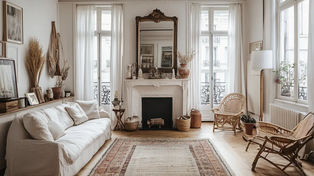
#4. Mistake: Wrong Scale
Scale errors are among the most common and most consistently overlooked mistakes in any interior, and the Parisian aesthetic is particularly sensitive to them. The wrong scale undermines the arrangement in a way that is difficult to diagnose — the room feels off but the specific reason is not immediately apparent — because scale is a relationship rather than an absolute quality. An object is not wrong in scale by itself; it is wrong in scale relative to what surrounds it.
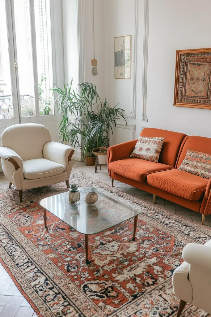
The undersized sofa
The most common scale error in a Parisian interior: a sofa that is too small for the room. This typically appears as a standard 2-seater sofa (160–180 cm) placed against a long wall in a room of 30–40 square metres, with the sofa occupying less than half the wall’s length and leaving large empty areas on either side. The room reads as provisional and incomplete because its primary piece is undersized for its context.
The correct scale: the sofa or settee should occupy between half and two-thirds of the wall it sits against. In a small room, this is achieved through a correctly proportioned 2-seater; in a larger room, a 3-seater or a chaise configuration may be needed to achieve the same proportion. The sofa need not touch the adjacent walls; a gap of 40–60 cm on either side is fine. But the overall visual weight of the anchor piece should feel correct for the wall behind it.
The too-small rug
The second most common scale error: a rug that is too small for the seating zone it is intended to define. A rug on which only the coffee table sits, with all the furniture around it on bare floor, fails to define any zone. A rug of the correct scale sits under the front legs of all pieces in the seating arrangement, or ideally under all four legs of every piece. For most living room arrangements, this means a minimum of 200 × 300 cm, and often larger.
The too-small mirror
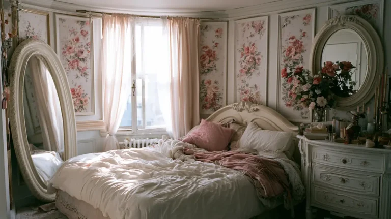
A mirror above a mantelpiece or on a primary wall that is smaller than the fireplace opening below it reads as a decorative object rather than an architectural element. The scale relationship between the mirror and the fireplace is one of the most frequently miscalculated in a Parisian interior. The mirror should be at least as wide as the fireplace opening, and ideally wider. Narrower reads as wrong.
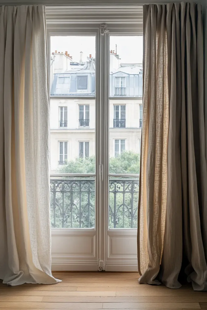
The too-high curtain rail
Curtain rails mounted at window-frame height rather than near the ceiling are a consistent scale error that makes rooms appear shorter. Moving the rail to within 10–15 cm of the ceiling, and cutting or ordering curtains to floor length, corrects the proportion immediately. The change requires only two new holes in the wall and the correct curtain length; it is one of the highest-return corrections available in any room.
| ➶ Large Vintage Kilim Rugs (200 × 300 cm and Above) — Etsy |
| A curated search for large vintage and antique kilim rugs on Etsy — specifically filtered for the 200 × 300 cm and above size range that constitutes a correctly scaled rug for most Parisian salon arrangements. Smaller sizes are widely available but are the source of one of the most common scale errors in a Parisian interior. The search covers Turkish, Afghan, and Caucasian flat-weave kilims in the faded, warm-palette register most appropriate for a Parisian interior. Filter by minimum size dimension and by age (vintage or antique) for the most relevant results. €145 – €420 depending on age, origin, and condition · Via Etsy Editorial note: The most important specification is size, not pattern. A correctly scaled rug — large enough to sit under the front legs of all pieces in the seating arrangement — transforms a Parisian salon arrangement more than any other single floor element. Under-scaling the rug is one of the most common and most correctable mistakes in this category. |
#5. Mistake: Synthetic Materials in the Wrong Places
The Parisian interior is built from natural materials: linen, wool, cotton, aged wood, brass, iron, ceramic, stone, glass. Synthetic materials are not categorically absent — they appear in some contexts in any contemporary interior — but they occupy specific positions, and when they appear in the wrong positions, they undermine the material quality of everything around them.
The two most damaging positions for synthetic materials in a Parisian-aspiring interior are the primary textile surfaces (cushion covers, curtains, upholstery) and the light fittings (lamp shades). In both cases, the synthetic material reads differently from natural materials in ways that are directly observable: synthetic fabric has a surface sheen and a feel that natural fabric does not; a synthetic lamp shade transmits light differently from a linen or silk shade.
Synthetic curtains: the most visible error
Polyester or polyester-blend curtains — even good ones, even in neutral colours — do not hang in the deep, relaxed folds of linen or heavy cotton. They hang in shallower, more uniform folds with a slight sheen that reads as contemporary in a way inconsistent with the Parisian aesthetic. Floor-length curtains are one of the highest-impact elements of a Parisian interior; floor-length synthetic curtains produce a visual result that undermines the entire room.
Ready-made linen curtains in natural or off-white tones are available at accessible price points from several retailers (IKEA, H&M Home, Zara Home). The material improvement from synthetic to linen at comparable price points is worth prioritising over many other purchases.
Synthetic lamp shades: the lighting mistake
A synthetic lamp shade — particularly a white or off-white shade in a stiff, semi-opaque synthetic fabric — transmits light in a flat, slightly harsh way that a linen or cotton shade does not. The difference is visible and immediately apparent when the lamp is lit: a linen shade glows warmly; a synthetic shade produces a flat, slightly clinical disc of light. For a lamp that is always on and defines the room’s evening quality, this distinction is significant.
What to do instead
Replace synthetic curtains with linen or heavy cotton equivalents as a priority purchase. For lamp shades, a simple replacement shade in linen or cotton can be sourced from lamp shade specialists or made to order at modest cost; the shade is typically interchangeable on a standard fitting. For upholstery, a full re-cover is a larger undertaking, but a slipcover in linen or a heavy linen-blend can transform the surface quality of an existing piece without the cost of reupholstery.
| → Cultiver — Pre-Washed Linen Fabric for Curtains and Upholstery |
| Cultiver is a specialist linen fabric and homewares brand offering pre-washed linen by the metre in natural, stone, and muted tones appropriate for curtains, cushion covers, and upholstery projects. The pre-washing produces the softened, slightly rumpled quality of well-used linen from the first day — the specific surface quality that distinguishes natural linen from synthetic alternatives. Sold by the metre; ships internationally. No affiliate relationship — included because the product directly addresses the most common synthetic-material error in Parisian interiors at an accessible price point. From approx. €18 per metre · Via Cultiver Editorial note: Use for replacement curtain panels (the natural and stone tones are the most versatile), cushion cover projects using a basic linen cover pattern, and slipcover material for existing upholstered pieces. The pre-washed finish eliminates the stiffness of new linen and means the material is ready for use without a pre-wash cycle. |
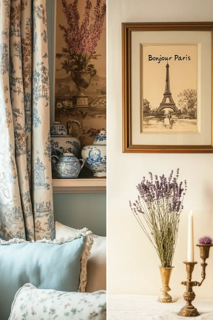
#6. Mistake: Making It Too Themed
A less obvious but equally consistent error is the over-thematic approach: selecting every element of the room specifically because it is ‘French’ or ‘Parisian’ or ‘vintage’, resulting in a room that reads as a French-themed set rather than as a genuinely inhabited French interior. The Eiffel Tower print on the wall, the ‘Bon Appetit’ sign in the kitchen, the lavender-scented everything, the toile-on-toile combination of curtains, upholstery, and wallpaper in the same room.
The error here is treating the Parisian aesthetic as a category of product rather than as a quality of arrangement and selection. A genuine Parisian interior does not contain objects that reference their own Frenchness. It contains objects that are beautiful, useful, or meaningful, which happen to be French because they were found in France or by people with a French sensibility. The absence of explicit French references is one of the markers of the genuine article.
The toile problem
Toile de Jouy is a genuinely French textile with a long documented history in French interiors. Used appropriately — a single wall in a contained room, or as a single cushion cover within a varied arrangement — it reads correctly. Used as the dominant material across multiple surfaces in one room (curtains, upholstery, and a bedspread all in the same toile), it reads as a themed installation rather than as a Parisian interior. The rule of one: one toile element per room is typically the maximum before it tips from reference to theme.
Explicit French references
Objects and prints that explicitly reference France — Eiffel Tower imagery, French flag colours, ‘Bonjour Paris’ typography, maps of Paris as purely decorative prints — are not present in genuinely Parisian interiors. They are present in tourist accommodation and themed retail environments. The distinction is important: an old map of Paris from a genuine 19th-century publication, hung because it is beautiful and historically interesting, is different from a decorative ‘Paris’ print purchased because it reads as French. One is an object; the other is a sign.
→ How to identify the real Parisian aesthetic versus the French Country aesthetic that is often confused with it: → Parisian Vintage vs French Country: What's the Difference?
#7. Mistake: All Reproduction, No Original
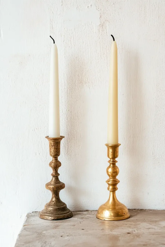
A room furnished entirely with new reproduction pieces — however well-chosen, however accurate to period — does not produce the Parisian result. It produces a room that looks like a stage set for a Parisian interior. The quality that the genuine article has and the reproduction lacks is the specific evidence of use and time: the worn edge of a table that has been used for decades, the foxed glass of a mirror that has been in the same apartment since the 1920s, the faded warmth of a kilim that has been walked on for thirty years.
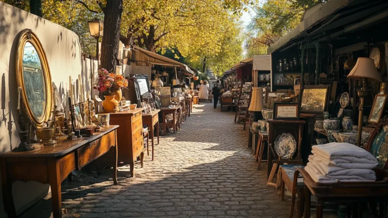
This quality cannot be purchased new at any price. It can only be found — at brocante, at vide-grenier, at estate sales, through second-hand platforms. The Parisian interior requires at least some genuine vintage pieces because their presence changes the character of everything around them. A room of well-chosen new pieces with one or two genuine vintage objects reads differently from the same room without those objects. The vintage pieces introduce the texture of time that unifies the room and makes it feel accumulated rather than assembled.
The threshold: how many genuine pieces are needed
There is no precise answer, but a useful working observation: two or three genuinely old pieces in a room — a candlestick, a mirror, a rug, a ceramic bowl — are sufficient to change the register of the entire space. They do not need to be expensive or significant; they need to be genuine. A €3 brass candlestick from a vide-grenier does more for the Parisian quality of a room than a €50 reproduction in the same position.
→ How to develop the eye and the practice that allows you to find and identify genuine pieces: → How to Develop a Parisian Eye for Interior Design
| ➶ Genuine Vintage French Objects (Brocante-Sourced) — Etsy |
| A curated search for genuine vintage and antique French decorative objects on Etsy — the most accessible online channel for introducing real vintage pieces into a room that currently contains only new or reproduction items. The search covers brass candlesticks, faience ceramics, small bronze objects, vintage frames, and mixed decorative pieces sourced by specialist sellers from French brocantes and household clearances. Filter by ‘vintage’ and ‘antique’ rather than ‘vintage style’ to ensure genuine pieces rather than reproductions. Each genuine piece introduced changes the character of everything around it. €8 – €95 depending on object type and condition Via Etsy Editorial note: Prioritise pieces that will sit beside existing new or reproduction items and introduce the texture of age. A genuine antique brass candlestick beside a new ceramic lamp changes both objects: the lamp benefits from the contextual warmth of the candlestick, and the candlestick is shown at its best by the contrast with the new piece. Introduce two or three genuine pieces and assess the room before adding more. |
#8. Mistake: Overhead Lighting as the Primary Source
The final consistent mistake — addressed more fully in the companion article on Parisian lighting — is the use of a single overhead light source as the room’s primary evening illumination. A central ceiling fixture switched on at dusk and used as the room’s main light produces a flat, slightly harsh quality that reads as institutional rather than inhabited. Every material in the room — the aged wood, the linen, the brass — looks its worst under a single overhead source at full intensity.
The correction is simple and does not require electricians or structural work: add table lamps and floor lamps at multiple points in the room, fit all bulbs at 2,200–2,700 K warm white, and put the overhead fitting on a dimmer if possible (or simply stop using it as the primary source). Use the overhead at a low setting for ambient glow only; use the table and floor lamps for the room’s primary evening light. This change costs less than most object purchases and produces a more immediate improvement in the room’s quality than almost any decorating decision.
“The most common lighting mistake costs nothing to correct. Stop switching on the overhead and switch on the table lamp instead. The room changes immediately.”
→ How the layered Parisian lighting approach works in practice — fixtures, bulbs, and placement: → The Psychology of French Chic: Why Less Feels More
| → Selency — Curated French Vintage Platform for Replacing Reproduction Pieces |
| Selency is a French online vintage marketplace used extensively by interior designers for sourcing genuine period pieces at fair prices. It is particularly useful for replacing the reproduction pieces described in this article with genuine alternatives: a genuine vintage brass chandelier in place of a reproduction, a period ceramic lamp base in place of a contemporary one, a genuine vintage kilim in place of a new printed rug. The curation is stronger than general marketplaces — sellers pass a quality review — and the selection leans toward the 19th and early 20th century. Ships across Europe. No affiliate relationship — included because it is the most appropriate platform for the specific correction described in Section 7. Variable by item · Via Selency Editorial note: Use Selency when you have identified a specific reproduction piece in the room that would benefit from replacement with a genuine vintage equivalent. The furniture and lighting categories are the most productive starting points. For smaller objects (candlesticks, ceramics, frames), the physical brocante or vide-grenier remains more cost-effective. |
The Common Thread: Patience and Selection
The mistakes described in this article share a common root: the attempt to produce the Parisian aesthetic quickly, through purchases made simultaneously, following a thematic logic rather than a selective one. The bright white walls, the matching sets, the overcrowded surfaces, the reproduction pieces — all of these reflect the logic of a room assembled as a project rather than accumulated as a practice.
The correction in each case is the same: slow down, select more carefully, remove more than feels necessary, introduce genuine pieces over time rather than reproductions all at once, and give the room time to become itself. The Parisian interior is not a style that can be installed. It is a quality that develops through attention, editing, and the specific patience of waiting for the right piece rather than accepting the available one.
The companion articles in this category address the positive version of each correction described here: what to do, what to use, and how to develop the eye and the practice that produces the result. This article is the negative space of that body of knowledge — the map of what not to do, which is sometimes more useful than the map of what to do.
“Every mistake described in this article is correctable without spending money. Most require only editing, repositioning, or the patience to wait for the right piece. The room is always closer than it appears.”
→ The complete Parisian Vintage Chic Interior guide — the full positive context for every correction described here: → Parisian Vintage Chic Interior: The Complete Style Guide