How Earth Tones Shape the Soul of Crafted Minimalism
What We Mean by Earth Tones in Crafted Minimalism
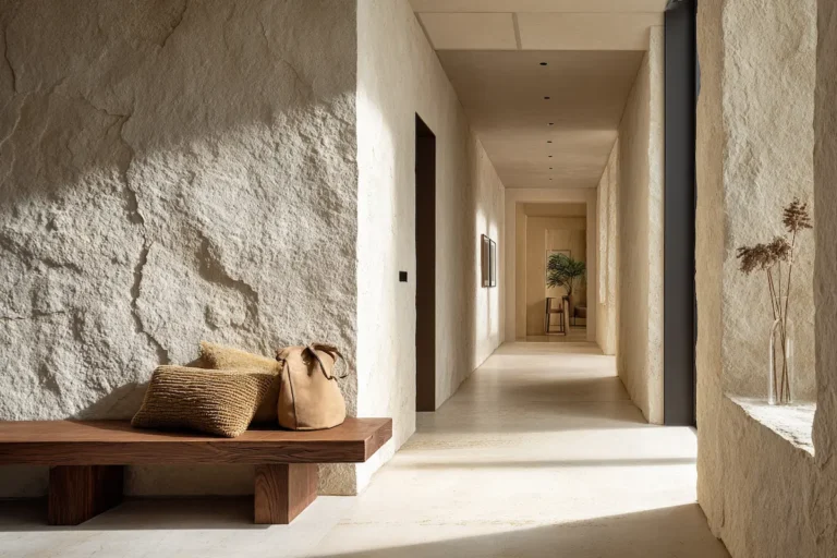
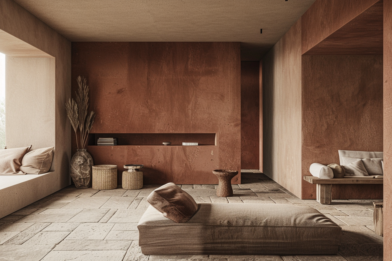
In Crafted Minimalism, earth tones are not a decorative choice — they are a structural language. They communicate origin, material honesty, and time. This is not about “everything beige,” but about colors that carry depth because they come from nature itself: clay, warm taupe, sand, stone, umber, and muted terracotta. These tones reference earth, minerals, lime, and soil — and their presence is felt before it is consciously noticed.
What sets earth tones in Crafted Minimalism apart from generic minimal interiors is their relationship with material. Color never leads; it supports. Wood must still read as wood, ceramic must retain its rawness, linen must show life and movement. When an earth tone becomes too flat, too smooth, or too perfect, it loses its crafted quality.
This is why cool greiges, pink-based beiges, or trend-driven “latte” neutrals rarely work here. They lack weight. They lack memory. True earth tones are never static — they shift with daylight, deepen in shadow, and gain character as surfaces age.
In this style, earth tones function as a foundation rather than an accent. They connect furniture pieces into a cohesive whole, allow negative space to exist without feeling cold, and introduce warmth without visual noise. Not as styling — but as the base layer upon which form, texture, and craftsmanship can rest.
Disclaimer: This post may contain affiliate links. That means if you click and purchase through one of these links, we may earn a small commission — at no extra cost to you. As an Etsy affiliate and Amazon Associate, I earn from qualifying purchases. We only recommend products we truly love or believe fit the style of our AI-generated designs.
Earth Tones as a Structural Tool, Not Decoration

In Crafted Minimalism, earth tones are not applied at the end of the process — they are built into the structure of the space from the beginning. Rather than acting as accents or styling layers, these tones help define hierarchy, balance, and visual weight.
Earth tones ground furniture. A low sofa in a warm taupe fabric feels anchored rather than floating. A stone or clay-toned surface gives mass to an otherwise minimal composition. This grounding effect is essential: Crafted Minimalism relies on fewer objects, so every piece must visually “sit” in the room with confidence. Color helps achieve that without adding clutter.
Unlike decorative color, structural color works quietly. It allows negative space to exist without becoming cold or empty. Walls, floors, and large furniture pieces share a muted, earthy language that connects them, even when forms differ. The result is cohesion without repetition.
Most importantly, earth tones support material expression. They do not compete with grain, texture, or imperfection — they frame it. Light interacts with these tones throughout the day, creating subtle shifts rather than sharp contrasts. This keeps the interior calm, tactile, and timeless.
In Crafted Minimalism, earth tones are not something you add. They are something you build on.
How to Choose Earth Tones That Feel Crafted (Not Flat)
Choosing earth tones for Crafted Minimalism is less about selecting a color and more about evaluating how that color lives within a material. The same shade can feel rich and grounded in one application, and completely flat in another. The difference lies in depth, texture, and origin.
The first criterion is material honesty. Earth tones work best when they emerge from the material itself rather than sitting on top of it. Think limewashed walls instead of painted beige, natural clay ceramics instead of glazed finishes, solid wood with visible grain rather than veneer. When color is embedded, it gains nuance.
Second, look for tonal depth instead of uniformity. Crafted earth tones are never perfectly even. They carry subtle variations — darker edges, lighter centers, gentle irregularities. These shifts prevent surfaces from feeling lifeless and allow them to interact with light throughout the day.
The third factor is aging potential. A true earth tone should improve over time. Stone darkens slightly, wood warms, ceramics develop character. If a tone relies on perfection to look good, it does not belong in this style.
Finally, avoid overly safe neutrals. Flat greige, pink-leaning beige, or trend-driven warm whites often erase contrast rather than support it. Crafted Minimalism favors earth tones with presence — colors that can hold their own without shouting.
Curated Picks: Earth-Tone Pieces I Personally Selected for Crafted Minimalism
The following pieces were not chosen to “fill” a space. Each one was selected because it carries material weight, ages beautifully, and uses earth tones as an extension of its construction — not as surface decoration. These are the kinds of objects that can anchor an interior without relying on excess styling.
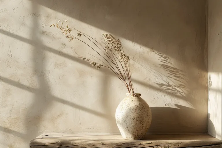
1. A Hand-Thrown Terracotta Vessel with Natural Patina

Why this works for Crafted Minimalism
This piece embodies the origin of earth tones: clay shaped by hand, fired imperfectly, and left largely untreated. The form is simple, but never sterile. Slight asymmetry and tonal variation give it presence without visual noise.
How the earth tone functions
The muted terracotta tone is not uniform. It deepens near the base, lightens at the rim, and reacts subtly to changing light. This variation is what keeps the object alive in a minimal setting.
Where it belongs
On a low console, stone plinth, or as a single object on a solid wood table. It needs space around it — not companions.
Why I chose this one
Many ceramic vessels imitate terracotta through glaze. This one is the color it shows. No finish, no correction, no attempt to perfect it.
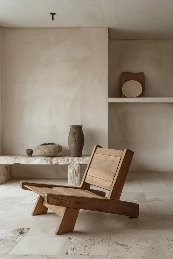
2. A Solid Wood Lounge Chair in Warm, Natural Oak
Why this works for Crafted Minimalism
Furniture in this style must visually carry its own weight. This chair does so through mass, proportion, and exposed joinery rather than upholstery or color contrast.
How the earth tone functions
The warm oak tone is not applied — it comes from the wood itself. Grain variation, knots, and slight color shifts give depth without distraction.
Where it belongs
Living rooms, reading corners, or transitional spaces where one strong furniture piece can stand alone.
Why I chose this one
Many minimalist chairs feel visually light to the point of fragility. This one feels grounded. It doesn’t disappear — it holds the room.
View the Pit Chair by MENA — a solid wood piece where material, weight, and craftsmanship do the talking.
3. A Natural Stone Coffee Table with Soft, Irregular Edges

Why this works for Crafted Minimalism
Stone introduces permanence. This table doesn’t rely on ornament; its impact comes from material density and restrained form.
How the earth tone functions
The stone’s color sits somewhere between sand and limestone, with subtle veining that only reveals itself up close. From a distance, it reads calm and unified.
Where it belongs
As a central anchor in a living space, paired with low seating and minimal accessories.
Why I chose this one
Perfectly polished stone often feels cold. This surface retains softness — both visually and tactually — which aligns better with the crafted approach.
View the Sofita Marble Coffee Table — a grounded stone piece chosen for its soft edges, weight, and calm material presence.
4. A Heavy Linen Textile in Muted Clay or Taupe
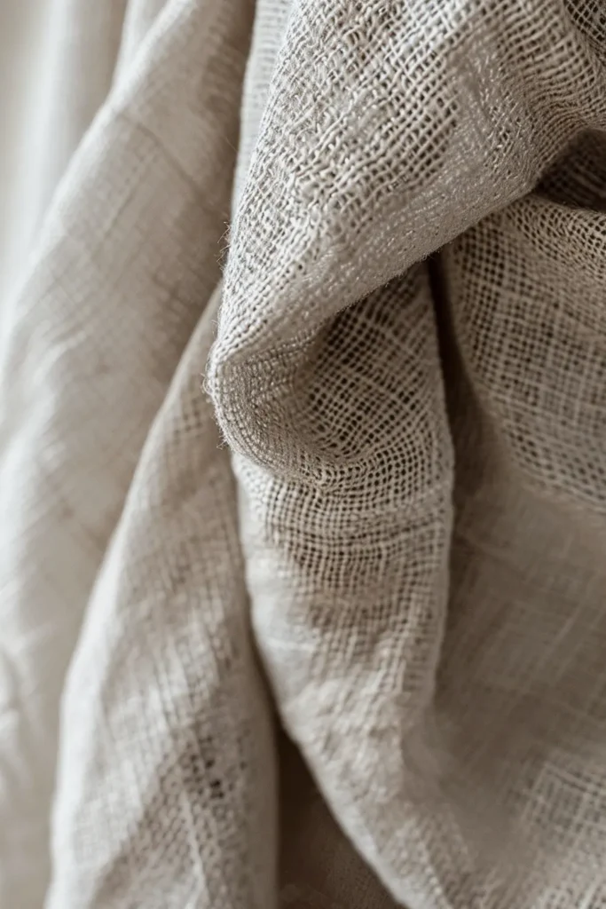
Why this works for Crafted Minimalism
Textiles are used sparingly here, but when they appear, they must add depth rather than decoration.
How the earth tone functions
The color is quiet, but the weave creates movement. Light catches the fibers differently throughout the day, preventing flatness.
Where it belongs
As upholstery, a single curtain panel, or a throw used with intention — never layered excessively.
Why I chose this one
Synthetic blends can mimic color, but they lack life. This linen gains character with use, not despite it.
Each of these pieces demonstrates the same principle: earth tones work best when they emerge from material, not trend. One strong, well-chosen object will always do more for a Crafted Minimalist interior than five neutral accessories ever could.
How to Combine Earth-Tone Pieces Without Overdoing It
One of the most common misconceptions about earth tones is that using more of them automatically creates cohesion. In Crafted Minimalism, the opposite is often true. Restraint is what allows earth tones to feel intentional rather than decorative.
Start with one dominant earth tone that sets the emotional temperature of the space. This might come from a large surface — a stone floor, a plastered wall, or a substantial furniture piece. All other tones should quietly support this base rather than compete with it. Think in relationships, not variety.
Limit yourself to two or three earth tones in total. Instead of adding more colors, create depth through material contrast: rough stone against smooth wood, dense ceramics next to woven textiles. The eye reads this as richness without visual clutter.
Repetition should be subtle. An earth tone doesn’t need to appear everywhere to feel connected — it only needs to reappear once or twice, ideally in different materials. A clay-toned ceramic can echo a warmer wall finish without matching it exactly.
Most importantly, resist the urge to “finish” the space with accessories. In Crafted Minimalism, cohesion comes from fewer, heavier elements, not from layering objects. When earth tones are allowed to breathe, they create calm, grounded interiors that feel complete without excess.
Common Mistakes When Using Earth Tones in Minimalist Interiors
Earth tones are often assumed to be “safe,” but when used without intention, they can easily flatten a space. One of the most common mistakes is relying on too many similar mid-tones. When everything sits in the same beige–taupe range, furniture loses definition and the interior starts to feel washed out rather than calm.
Another frequent issue is using earth tones only in accessories. Cushions, throws, and small décor items rarely carry enough visual weight to anchor a space. In Crafted Minimalism, earth tones belong primarily on structural elements: floors, walls, and substantial furniture pieces.
A third mistake is choosing tones that are too perfect. Overly smooth finishes, uniform color application, or synthetic materials often strip earth tones of their depth. Without texture or variation, these colors stop interacting with light and become visually static.
Finally, many interiors fail by ignoring contrast in form. Earth tones alone do not create interest. A room filled with soft colors but lacking strong silhouettes or material contrast will feel underwhelming.
Crafted Minimalism avoids these pitfalls by treating earth tones as part of the architecture of the space — not as a decorative afterthought.
Final Thoughts: Earth Tones as the Emotional Layer of Crafted Minimalism
Earth tones are often described as calming, but within Crafted Minimalism their role goes deeper than atmosphere alone. They define the emotional weight of a space. When chosen with intention, these tones ground interiors without making them heavy, and add warmth without visual excess.
Rather than functioning as a trend or finishing touch, earth tones work best when they are integrated early in the design process. They support material expression, give furniture presence, and allow negative space to exist without feeling empty. This is what separates a crafted interior from a merely neutral one.
The most successful Crafted Minimalist spaces are built on fewer, more deliberate choices. One chair with visual weight will do more than a room full of accessories. One stone surface chosen for its texture and aging potential will outlast any seasonal palette.
If you are investing in pieces for this style, prioritize materials that carry their own color, depth, and history. Earth tones reveal their value over time — not at first glance.
Choose fewer objects. Choose better materials. Let earth tones do the quiet work of holding the space together.