The Best Colour Palettes for a Baby Nursery
A nursery colour palette is not a wall colour. It is a system: the relationship between the wall tone, the floor or rug, the dominant textile, and the accent. Each of these affects how the others read. A wall colour that looks warm and settled when seen against an oak dresser and a sand rug can read as flat and cold against a white-painted dresser and a grey rug. The palette is not any single element — it is the sum of their relationships.
This article presents four complete nursery colour palettes, each tested as a system. For each palette, specific paint colours, rugs, curtains, and wallpaper are given where they apply — with direct product links so you can see exactly what is being referred to. All products are chosen for the quality of their match to the palette they are in, not for general popularity. Product links include direct brand pages, Etsy makers, and Amazon where these are the most appropriate source for the specific piece.
A note on the selection method: we only link to products whose specific visual character is verifiable online. Where a paint colour, a rug pattern, or a curtain texture matters to the palette, the product page must show it accurately enough to confirm the recommendation. General category links are not included; every product link in this article goes to a specific product.
→ Nursery Design Trends: Classic vs Modern vs Boho
→ The Psychology of Calming Colours in a Baby’s Room
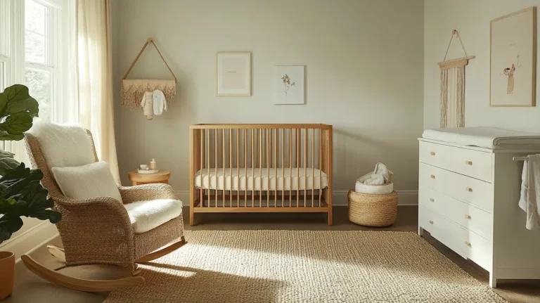
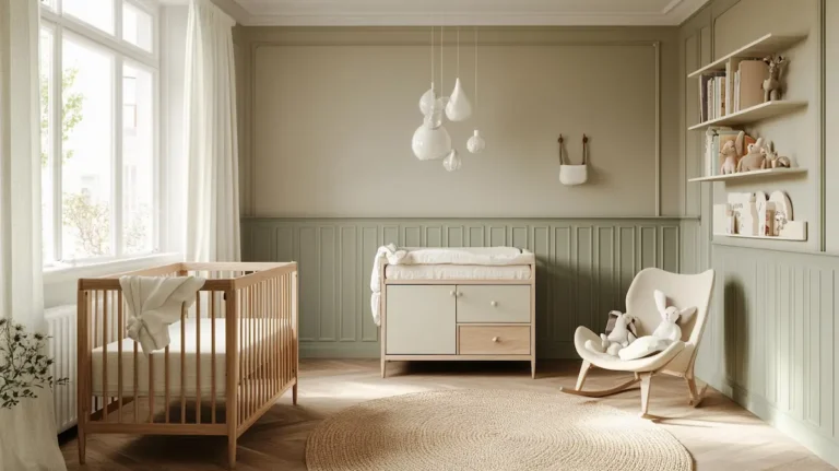
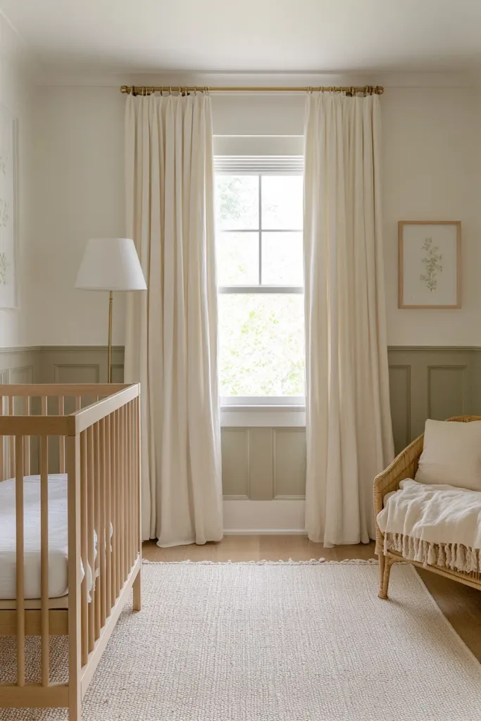
Palette 1: Warm Neutral
The warm neutral palette is the most versatile and the most forgiving of the four. It works in rooms of any orientation and coexists with natural wood, painted furniture, and a wide range of textile approaches. Its defining quality is temperature coherence: every element belongs to the same warm, yellow-or-orange-biased temperature family. There is no cool grey, no blue-white, no synthetic green. The result reads as effortlessly settled.
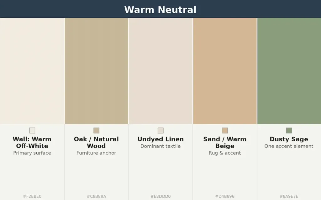
The wall: Benjamin Moore White Dove OC-17
White Dove is the most-specified warm white for nurseries among interior designers working in neutral palettes. Its appeal is its combination of warmth (a faint yellow-cream undertone) with sufficient lightness (LRV 85) to make a small room feel generous. It does not tip into yellow under warm artificial light, and it reads correctly against both natural oak and white-painted furniture. Available in the Natura zero-VOC formulation, which is the correct specification for a nursery.
| → Benjamin Moore White Dove OC-17 — Natura Zero-VOC Matte The gold standard warm white for nurseries in a neutral palette. LRV 85. Available in Natura zero-VOC, which is specifically formulated to minimise off-gassing in enclosed spaces occupied by infants. Flat / matte finish recommended for nursery walls. From approx. €9 sample / €60+ per gallon · Via Benjamin Moore Why this product: The combination of warm undertone, high LRV, zero-VOC formulation, and widespread availability makes this the most reliable single wall colour recommendation for the warm neutral palette. Order a large sample before committing to a full room. |
The rug: Lorena Canals Air Dune White — washable cotton
A flat-weave cotton rug in the warm neutral palette needs three qualities: a warm undertone (not cool grey or blue-toned white), a low pile that does not catch feet in the dark, and machine washability. The Lorena Canals Air Dune White meets all three. It is handmade in 100% cotton, dyed with non-toxic dyes, and machine-washable at 30°C — which is essential for a nursery floor covering. Its warm white tone reads correctly against both natural oak and painted furniture.
| ➶ Lorena Canals — Air Dune White Washable Cotton Rug 100% cotton, non-toxic dyes, machine-washable at 30°C. Flat-weave with a warm white ground tone. Available in multiple sizes including 4′7″ x 6′7″, which covers the primary floor zone of a standard nursery. From approx. €85 / £75 (4′7″ x 6′7″) · Via Amazon Why this product: The warm white ground of this rug reads correctly against White Dove walls and natural oak furniture without the temperature conflict that a cool-toned white rug would create. Its machine-washable specification is non-negotiable for a nursery floor covering. |
The curtains: IKEA DYTAG 100% Linen — white
Floor-length linen curtains in white or undyed linen are the correct textile pairing for the warm neutral palette. The IKEA DYTAG in white is 100% linen with an irregular woven texture that catches light in a way that warms the room — its surface is not uniformly flat, which makes it more visually interesting than a plain cotton or synthetic equivalent. It is a rod-pocket curtain designed for use with a separate blackout roller blind behind it, which is the correct configuration for a nursery window treatment: blackout function from the roller, warmth and texture from the linen over it.
| → IKEA DYTAG Curtains — 100% Linen, White, 145×300 cm 100% linen in white with a natural irregular woven texture. Available in multiple lengths including 250 cm and 300 cm for floor-length installation. Rod-pocket heading. Not blackout; pair with a separate cordless roller blind for nursery blackout function. Approx. €40–50 / £35–45 per pair · Via IKEA Why this product: The DYTAG’s linen texture contributes a warm, light-diffusing quality that synthetic curtains in the same nominal white do not produce. Its correct pairing is a cordless blackout roller blind inside the window recess, with the linen over it for warmth and aesthetics. Verified as 100% linen on IKEA product page. |
→ Best Linen & Muslin Curtains for a Nursery
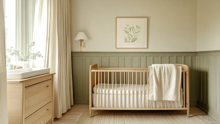
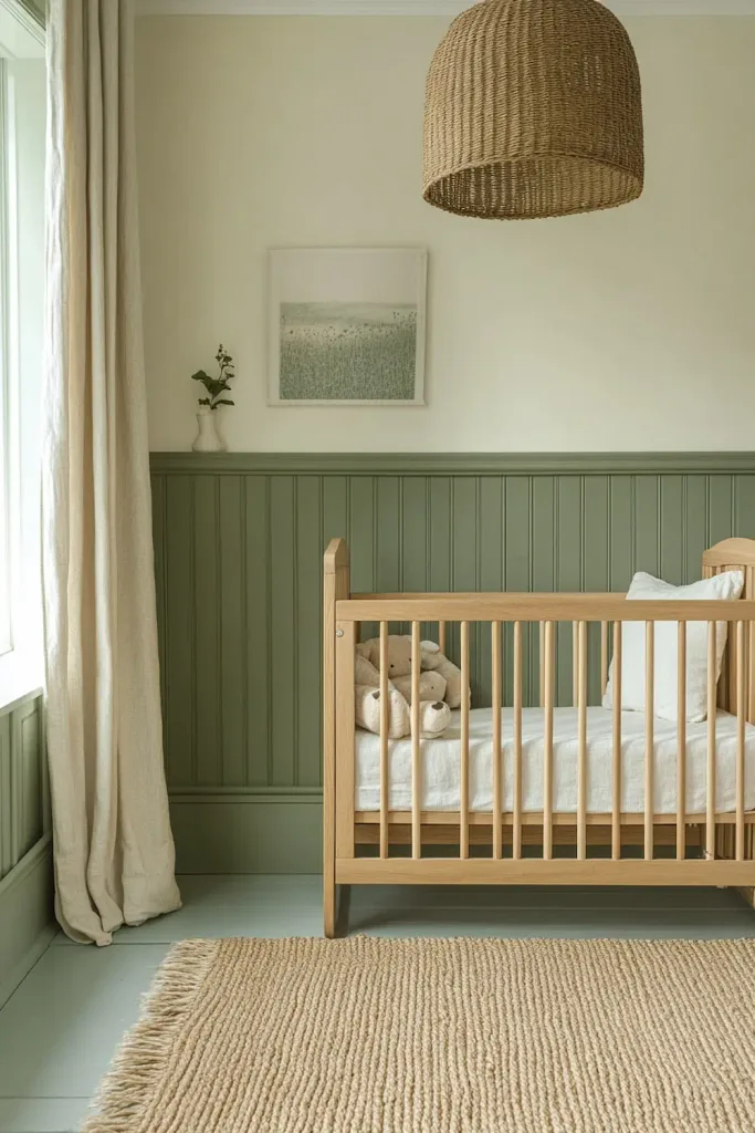
Palette 2: Sage & Oak
The sage and oak palette is the current dominant approach in modern nursery design — natural wood furniture, a muted sage green on the feature wall or wainscoting, warm off-white on the remaining walls, and undyed linen for the curtains and bedding. Its visual register is modern but approachable, and it works equally well in classic and contemporary homes.
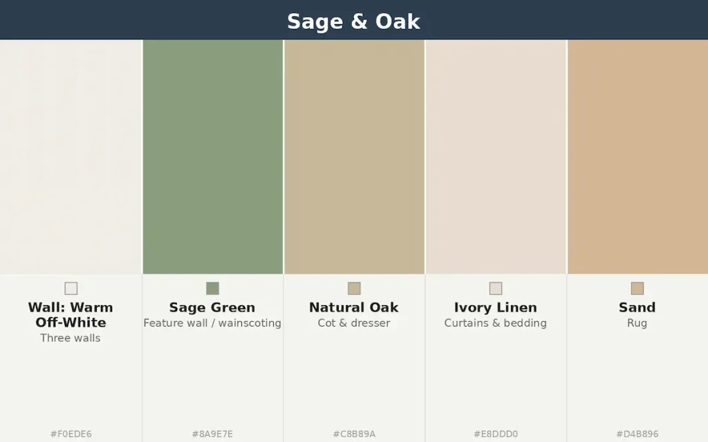
The wall: Little Greene Sage Green (80)
Little Greene Sage Green is the most widely used sage paint colour in professionally designed nurseries in the UK and the one most consistently referenced in interior design publications. It is a warm-toned sage — slightly yellow-green, not blue-green — which means it reads correctly against warm off-white walls and natural oak without introducing temperature conflict.
The Intelligent Matt Emulsion finish is washable, which is appropriate for nursery walls. Note that Little Greene’s paints are water-based and low-VOC but not zero-VOC; allow maximum ventilation and drying time before the room is occupied.
| → Little Greene Sage Green (80) — Intelligent Matt Emulsion A warm-toned muted sage in Little Greene’s washable Intelligent Matt finish. Low-VOC, water-based. Available from the Little Greene website directly and from John Lewis & Partners in the UK. This is a warm yellow-green sage, not a cool blue-green — specifically important for temperature coherence in a warm-palette nursery. Approx. €45–60 / £40–55 per 2.5L · Via Little Greene Why this product: The warm yellow-green undertone of Little Greene Sage Green (80) is why it reads correctly against natural oak and warm off-white in a way that cooler sages (such as F&B Mizzle or similar) do not. Its Intelligent Matt finish is washable without a sheen, which is the correct specification for a nursery accent wall. |
The rug: Etsy — handmade jute flat-weave in natural
The sage and oak palette works best with a natural jute or cotton flat-weave rug in a warm sand or undyed tone. The jute’s irregular natural texture contributes to the room’s warm material register.
On Etsy, handmade jute flat-weave rugs from Indian artisan workshops are available at sizes appropriate for a nursery floor at prices significantly below equivalent high-street options. The key specification: 100% natural jute (not blended with synthetic), flat-weave rather than pile (easier to clean and less likely to catch feet), and a natural undyed or warm sand tone rather than a dyed or printed surface.
| ➶ Handmade Jute Area Rug — Natural Flatweave, Custom Size 100% natural jute, flat-weave, made to order in any size. Warm natural undyed tone. Handmade by artisans. Available from multiple Etsy workshops; the listing at the link below is from a seller with confirmed positive reviews for material quality. From approx. €65 / £55 (5′ x 8′) · Via Etsy Why this product: Natural jute’s irregular surface texture warms the colour temperature of any nursery palette it sits in, which is why it outperforms synthetic alternatives in the same nominal colour. Confirm the size before ordering — a rug for a standard nursery floor zone should be at least 160×230 cm to cover the primary floor area under the cot and beside the nursing chair. |
The wallpaper: feature wall only
In the sage and oak palette, wallpaper is optional and most effective on a single feature wall (the wall behind the cot) only. A small-scale botanical print in sage on cream, or a subtle textured wallpaper in warm off-white, adds the visual interest that a plain-painted approach does not provide.
The sage paint colour on the other walls and the wainscoting handles the palette’s colour statement; the wallpaper’s role is to add pattern texture on the one wall where the cot is seen directly.
→ Best Wallpaper for a Baby Nursery
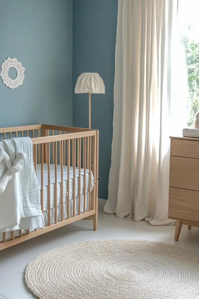
Palette 3: Dusty Blue
The dusty blue palette is the cool-temperature alternative to the warm neutral and sage families. It works best in south- or east-facing rooms where direct or indirect warm light counteracts the coolness of the palette.
In north-facing rooms, a dusty blue palette will read as cold unless paired with warm-toned natural materials — oak furniture, jute rugs, warm-white ceramic lamps — that contribute temperature warmth even as the wall and textile tones are cool.
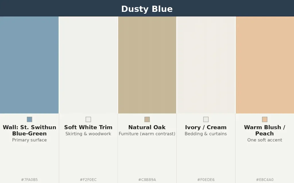
The wall: St. Swithun by Fleetwood, or a similar dusty blue-grey
A note on paint recommendations for the dusty blue palette: undertone matters more than the brand behind it. St. Swithun by Fleetwood is a serene, confidently blue-green colour that reads as calm rather than cold, with the blue tones coming through strongly against white trim. As with any dusty blue-green, it will read differently across the day and across room orientations; in a north-facing room it can read as cooler, so the correct specification there is to pair it with warm-oak furniture and warm-white ceramics, as described above.
For parents who want a softer, greener-leaning dusty blue, Farrow & Ball Skylight No.205 is a worthwhile alternative to compare a sample pot against, at a similar saturation level. Skylight is available in Modern Emulsion (walls) and Modern Eggshell (woodwork); F&B paints are sub-5g/L VOC in Modern Emulsion. Always compare sample pots of both colours side by side on the actual wall before committing, since orientation and light change how each one reads.
| → St. Swithun by Fleetwood Prestige — Air Purifying Scrubbable Matt (walls) A serene, dusty blue-green that reads as calm and settled, with strong blue undertones that contrast beautifully against white trim. Available from Fleetwood’s Prestige range in an air-purifying scrubbable matt finish that helps break down airborne chemicals — a genuinely useful property for a nursery wall. Sample pot strongly recommended before full-room purchase, as with any dusty blue-green, this colour will read differently in cool north-facing light versus warm south-facing light. From €5.00 tester / from €42.00 per 2.5L · Via Editorial Why this product: St. Swithun’s confidently blue, slightly dusty character gives the dusty blue palette real presence rather than reading as a washed-out grey. Pairing it with white trim or skirting boards sharpens the contrast and keeps the room from feeling flat. The air-purifying matt finish is a practical bonus for a room where indoor air quality genuinely matters. |
The key pairing rule for dusty blue: always warm the furniture
The dusty blue palette only reads as calm — rather than as cold or clinical — when the furniture introduces warmth that the wall and textile tones do not have. Natural oak or beech furniture, ceramic lamps in off-white or warm cream glazes, and a rug in warm sand or ivory (not in grey or blue tones) are the warming elements that the palette requires. A dusty blue room with grey-painted furniture and a cool-toned rug will read as cold and institutional. The same blue room with oak furniture and a sand rug will read as settled and considered.
| → Farrow & Ball Skylight No.205 — Modern Emulsion (alternative) A clean, fresh dusty blue-grey at similar saturation to St. Swithun, with a more neutral, less assertively blue character. A useful option if you want something a touch softer than St. Swithun’s confident blue. Available as a sample pot for testing before purchase. Approx. €10 sample pot / €120+ per 2.5L · Via Farrow & Ball Why this product: Recommended as a softer alternative to St. Swithun for parents who want a more neutral, less assertively blue wall colour. Compare a sample pot of each side by side on your actual wall before committing, since orientation and light change how both colours read. |
The rug: a handwoven natural jute rug to balance the cool wall
In the dusty blue palette, the rug is the single most important warming element in the room. A rug in warm sand, ivory, or undyed natural fibre provides the temperature contrast that prevents the room from reading as cold.
A handwoven natural jute rug is a particularly effective choice here: its irregular, golden-beige weave introduces exactly the warmth a cool wall needs, and a round shape sized for a nursing corner avoids overwhelming a smaller floor area.
| ➶ FRELISH DECOR Handwoven Jute Area Rug — Round, Natural 100% natural jute, handwoven by artisans in a braided, reversible construction. The warm golden-beige tone of undyed jute provides the temperature contrast the dusty blue palette requires. Available in a 4’ round size, suitable for a nursing corner; larger rectangular sizes are also available for covering the primary floor zone. Approx. $40–50 (4’ round) · Via Amazon Why this product: The natural, undyed warmth of handwoven jute is why it belongs in this palette recommendation rather than a cooler or more processed alternative. In a dusty blue room, the rug’s golden-beige tone and irregular weave visually warm the floor plane and prevent the cool wall from making the whole room read as cold. Note: jute is not machine-washable and is best spot-cleaned; pair with a washable cotton layer underneath in high-mess zones if needed. |
→ Best Nursery Rugs: Soft, Safe & Stylish
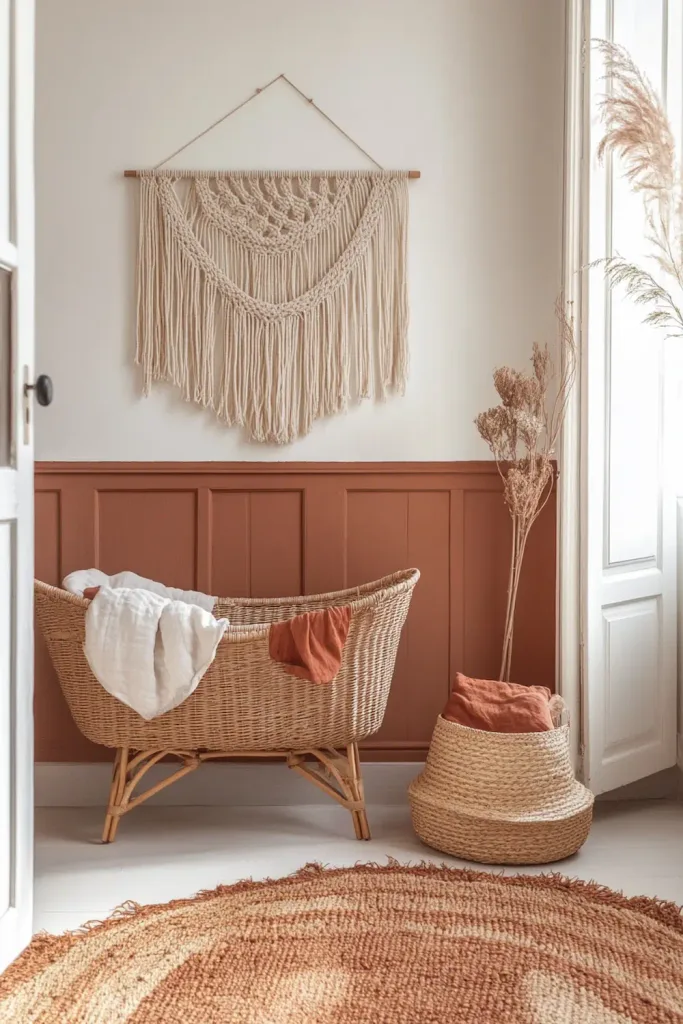
Palette 4: Terracotta Boho
The terracotta boho palette is the warmest and most saturated of the four. Its visual register is distinctly boho — layered natural materials, warm earthy pigments, and a higher overall decorative density than the other palettes. It works in rooms of any orientation because its palette is warm enough to counteract even strong indirect north-facing light. Its risk, as described in the nursery design trends article, is over-filling: the accumulative logic of the boho aesthetic requires a deliberate edit.
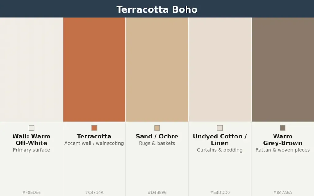
The wall: warm off-white with a terracotta accent
In the terracotta boho palette, the primary walls are warm off-white — the same White Dove or equivalent warm white used in Palette 1 — with a single accent wall or wainscoting in a terracotta or warm clay tone. The terracotta is the palette’s most saturated element and its visual anchor; all other elements are in lower-saturation warm neutrals.
For the terracotta element, Farrow & Ball’s Red Earth No.64 is a widely available, well-documented terracotta that reads as warm and earthy rather than orange or primary. It is available in Modern Emulsion. An alternative at a lower price point is Little Greene’s Earthen Vessel, which sits in a similar warm clay register. Both should be sampled against the intended white before purchase: terracottas can shift significantly under different light conditions.
| → Farrow & Ball Red Earth No.64 — Modern Emulsion A warm, earthy terracotta in Farrow & Ball’s low-VOC Modern Emulsion. LRV approximately 18 — a relatively deep tone, best used on a single accent wall or wainscoting rather than all four walls. Reads as warm and settled in both natural and artificial light. Sample pot strongly recommended. Approx. €10 sample pot / €120+ per 2.5L · Via Farrow & Ball · Why this product: Red Earth is specified here rather than a brighter or more orange-toned terracotta because its earthy, slightly ochre-brown quality keeps it in the warm-neutral register of the boho palette rather than reading as a vivid accent. A terracotta that is too orange-vivid disrupts the palette’s temperature coherence. Test against the wall white before committing. |
The rug: layered natural textiles with an edit rule
The terracotta boho palette is the one context in this guide where a layered rug arrangement is appropriate. The edit rule described in the nursery design trends article applies: a maximum of two rugs (a larger base rug in warm sand or natural jute, a smaller accent rug in terracotta or warm rust on top), with the edge of the upper rug not falling in any primary floor path. The base rug must have a non-slip underlay.
| Handmade Wool Flatweave Rug — Terracotta & Sand (Moroccan / Berber style) Handwoven wool flat-weave in warm terracotta, rust, and sand tones. Available from multiple Etsy artisan sellers. Confirm 100% wool (or cotton) construction rather than synthetic blend. Flat-weave rather than pile for practical nursery use. From approx. €70 / £60 (4′ x 6′) · Via Etsy Why this product: The terracotta boho palette requires a rug with genuine warm-earth pigmentation, which handmade wool or cotton flat-weaves from artisan sources consistently provide. Mass-market synthetic alternatives in ‘terracotta’ colourways frequently have a cooler or more orange-vivid tone that disrupts the palette. Verify the tone from multiple product photos before ordering. |
The accent textile: natural cotton macramé wall hanging
The macramé wall hanging is the terracotta boho palette’s most distinctive decorative element. The safety specification is covered in the nursery safety essentials article — the hanging must be mounted so its lowest point is above the cot’s top rail with clear margin.
For the palette: undyed natural cotton macramé reads correctly against terracotta walls because its warm cream tone belongs to the same temperature family as the rest of the palette. Dyed macramé (in grey, black, or cool white) reads incorrectly.
| Handmade Natural Cotton Macramé Wall Hanging — Large Knotted in undyed natural cotton rope by Etsy artisan makers. Mounted on a natural wood dowel. Warm cream-natural tone — the undyed cotton reads correctly against terracotta and warm off-white walls. Available in multiple sizes; for above-cot placement, choose a size whose width does not exceed the width of the cot below it. From approx. €35 / £30 (medium) · Via Etsy Why this product: Handmade macramé in genuine undyed cotton produces the warm, slightly irregular material quality that gives the boho palette its character. Mass-produced versions in uniform synthetic cord look similar in photographs but read differently in person — the regularity of machine production removes the texture variation that provides the material warmth. Etsy is the most reliable channel for genuine handmade pieces at accessible prices. |
How to Choose Between the Four Palettes
If the choice between the four palettes above is not immediately clear, the two questions that most reliably identify the right one are: what is the orientation of the nursery room, and what is the material register of the rest of the home?
North-facing room: Warm neutral or terracotta boho. Both palettes have enough inherent warmth to counteract the cool indirect light of a north-facing room. The dusty blue palette in a north-facing room without significant warm-toned furniture will read as cold. The sage and oak palette can work in north-facing light if the sage is warm-toned (Little Greene Sage Green rather than a cool blue-sage).
South-facing room: All four palettes work in south-facing rooms. The dusty blue palette is most viable here because the warmth of direct light counteracts the coolness of the palette. The terracotta boho palette in a south-facing room in summer may read as warm to the point of uncomfortable; in this case, keep the terracotta on a single wall rather than as an all-room palette.
Modern or Scandi home aesthetic: Warm neutral or sage & oak. Both palettes coexist naturally with the material register of a contemporary Scandinavian-influenced interior. Terracotta boho requires more deliberate integration into a minimal modern home to avoid reading as stylistically inconsistent.
Traditional or eclectic home aesthetic: All four palettes integrate, but classic botanical wallpaper (a separate product category from the wall palettes above) is most at home in the warm neutral context. See the wallpaper link below for specific wallpaper recommendations that work within each palette.
→ The Art of Layering Textures in a Nursery
Palette at a glance
| Palette | Best room orientation | Furniture material | The single edit rule |
| Warm Neutral | Any | Natural wood or white-painted | No cool-toned element anywhere |
| Sage & Oak | Any | Natural oak or beech | Sage on one surface only |
| Dusty Blue | South / east-facing preferred | Natural wood (warm oak) | Warm rug and furniture to balance cool wall |
| Terracotta Boho | Any — best in north-facing | Rattan, natural wicker | Max. two rugs; one wall hanging above cot rail |
Where to go next
A palette is a system. Once yours is established, the articles below develop the specific products that complete it: the rugs, curtains, and wallpaper that turn a colour plan into a finished room.
→ Nursery Design Trends: Classic vs Modern vs Boho
→ The Psychology of Calming Colours in a Baby’s Room
→ The Art of Layering Textures in a Nursery
→ Best Nursery Rugs: Soft, Safe & Stylish
→ Best Linen & Muslin Curtains for a Nursery
→ Best Wallpaper for a Baby Nursery