The Psychology of Calming Colours in a Baby’s Room
Colour is the most immediately felt quality of any room, and the least understood. Most parents making nursery decisions do so by preference — a swatch held up against the light, a palette saved from a social media image — without a clear framework for why certain colours feel calming and others do not. This article provides that framework. Not as a set of rules, but as a set of principles that make the relationship between colour and perceived calm legible, so that every colour decision in the nursery can be made with understanding rather than intuition alone.
The principles covered here are based on the observable properties of colour — temperature, saturation, contrast, and surface finish — and on how those properties interact with light in a domestic interior. No developmental or neurological claims are made. The goal is not to explain what a baby experiences, which is complex and contested territory, but to explain what an adult occupant experiences in a room — because the adult is in the nursery for many hours each day, and a room that genuinely reads as calm to adult perception is also the room most likely to provide a settled environment for the child.
→ What Is a Nursery Style? How to Choose the Right Look
Disclaimer & transparency
This article was created with the assistance of AI tools and assembled and edited by a human editor. While care has been taken to ensure accuracy, I cannot personally verify every technical detail. The information provided here is intended as a general guide, not as professional or technical advice. Always verify compatibility with your specific devices and systems before purchasing or installing anything described in this article.
Affiliate disclosure: This site participates in the Amazon Associates Programme and the Etsy Affiliate Programme. If you purchase through some of the links, at no extra cost to you, I may earn a small commission. I only recommend products I believe are genuinely suitable for the use case described.
Why Colour Is a Structural Decision, Not a Decorative One
Colour in a nursery is treated as a finishing decision by most parents: something chosen after the furniture has been ordered, the cot position decided, the curtains specified. This ordering is backwards. Colour is the element that affects the perception of every other element in the room. The same oak dresser reads differently against a cool grey-white wall than against a warm off-white one. The same linen curtain looks more or less yellowish depending on the wall it is seen against. The same floor area appears larger or smaller depending on the reflectance of the walls around it.
Making colour a finishing decision means that all the other decisions have already constrained what colour can do. The furniture is fixed, the textiles are ordered, and the colour must now be chosen to work with choices that were themselves not made with colour in mind. The result is often a room that is visually coherent at the level of each individual element but somehow restless as a whole — because the colour relationships were never considered as a system.
The more productive approach: identify the governing colour principle of the nursery before making any other decisions. This does not mean choosing a precise paint colour before buying a cot. It means deciding on the colour temperature family of the room — warm or cool — and on the intended saturation level — light and muted, or richer with one or two deeper accents — before any individual purchases are made. All subsequent decisions can then be tested against these principles.
“Colour is not the last decision. It is the framework within which all other decisions either succeed or fail.”
Colour Temperature: The Single Most Important Variable
Colour temperature is the most important and most frequently misunderstood variable in nursery colour decisions. Every colour has an underlying temperature — warm (biased toward yellow, orange, or red) or cool (biased toward blue, green, or grey) — and this temperature determines how that colour interacts with every other colour in the room.
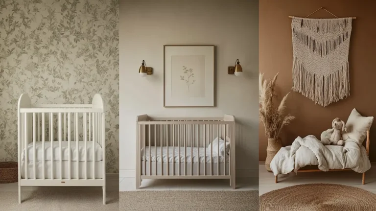
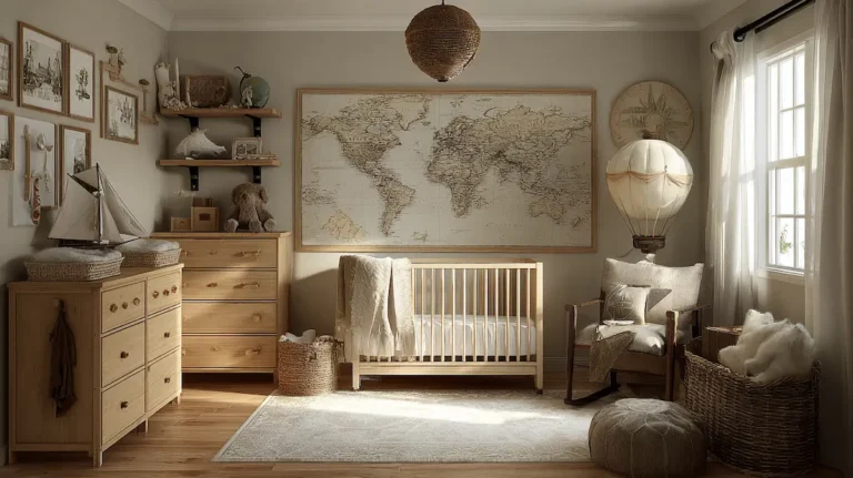
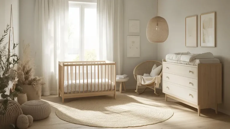
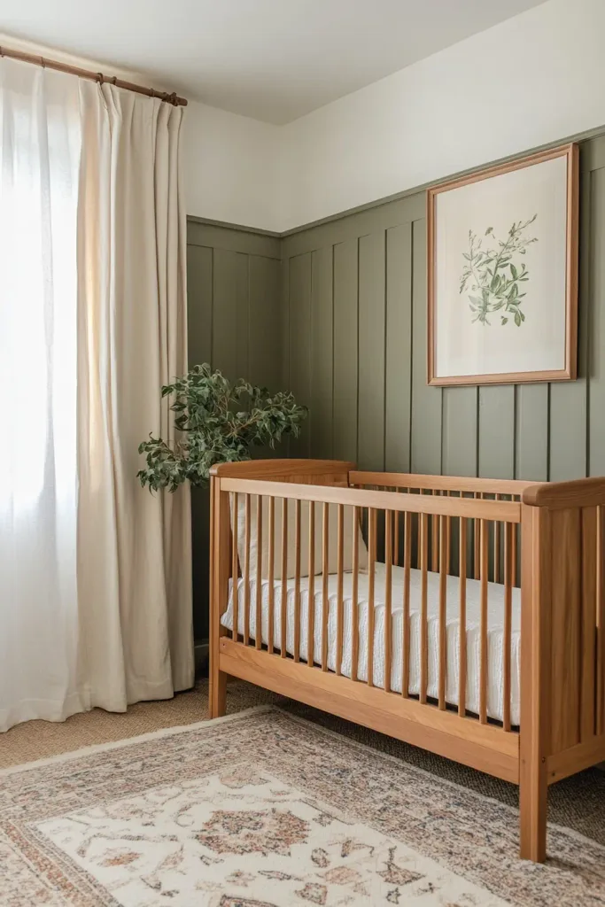
Temperature coherence — the quality of a room where all the dominant colours belong to the same temperature family — is the single most reliable predictor of whether a room reads as calm. A room where all the dominant colours are warm reads as settled and inviting. A room where all the dominant colours are cool reads as fresh and airy. A room where the dominant colours are a mix of warm and cool undertones — where a warm cream wall meets a cool grey floor, or where warm oak furniture is set against a cool blue-white paint — reads as subtly restless, without the cause being immediately identifiable.
Why temperature conflicts produce visual restlessness
The perception of restlessness in a room with conflicting colour temperatures is not a matter of taste. It is a consequence of how adjacent colours interact. When a warm colour (yellow-undertone white) is placed next to a cool colour (blue-undertone grey), each makes the other appear more extreme: the warm colour looks more yellow than it would against a neutral background, and the cool colour looks more blue. The eye moves between these competing signals repeatedly, which is the visual experience of a restless room.
In a nursery, where the surfaces are large — walls, floor, ceiling, the face of the cot, the body of the dresser — and where the room is experienced at close range and over long periods, this restlessness is amplified. A sitting adult feeding at 3 a.m. has nothing to do but perceive the room. The colour relationships that are merely suboptimal in a living room become clearly uncomfortable in a nursery.
Identifying temperature in practice
The challenge with colour temperature is that it is not always visible at first glance. A white wall can be warm or cool, and the difference between them is only apparent when the paint is on the actual wall next to the actual furniture in the actual light of the actual room. The standard approach — comparing paint swatches in a shop or on a screen — is almost useless for assessing temperature, because the swatch is seen against a neutral background in artificial light, not against the specific materials and surfaces it will live with.
The reliable method: obtain large paint samples (at least A4 size, ideally larger) and apply them directly to the wall next to the surfaces they will coexist with. Assess them at different times of day and in different light conditions — morning and afternoon natural light, and at evening with the specific bulbs that will be in the room. A paint that looks warm in a shop sample can read as cool on a north-facing wall in afternoon light. A paint that looks cool in isolation can look warm next to certain wood tones.
Saturation: How Much Colour Is the Right Amount
Saturation — the intensity or purity of a colour — is the second major variable in nursery colour decisions. High saturation means a colour that is vivid and pure: a bright cobalt blue, a saturated grass green, a strong primary red. Low saturation means a colour that is muted, grayed, or reduced: a dusty sage, a faded blue, a chalky rose. Unsaturated colours have had grey, white, or black added to reduce their intensity.
In nursery design, the relationship between saturation level and perceived calm is direct and consistent: lower saturation reads as calmer. This is not because saturated colours are inherently wrong, but because high saturation increases visual demand — it asks more of the eye and of the attention. In a room where the adult occupant is tired, feeding, settling, or simply trying to rest, low visual demand is a practical as well as an aesthetic quality.
The problem with ‘muted’ as a rule
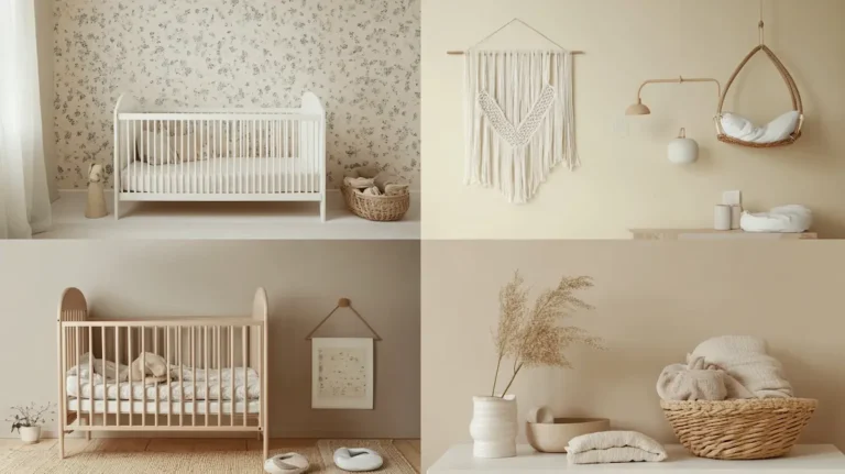
The instruction to ‘keep the nursery palette muted’ is widely given and consistently misapplied. Muted does not mean pale. It does not mean desaturated across every surface and element. It means that the dominant surfaces — the walls, the ceiling, the largest textile — are in low-saturation colours, while accent elements can carry slightly more colour without disrupting the overall calm of the room.
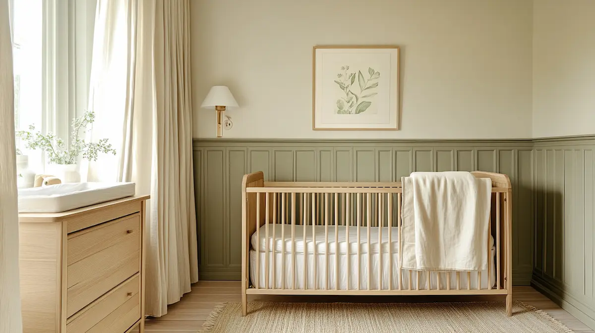
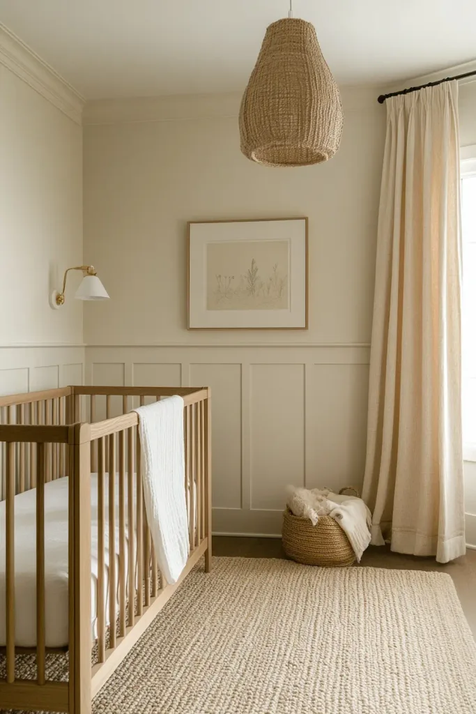
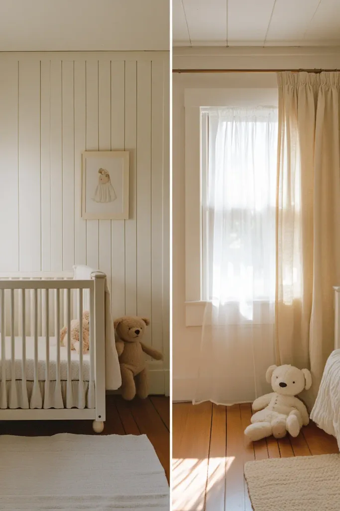
A room that is uniformly pale — all ivory walls, all cream textiles, all white-painted furniture — has a different problem: it reads as undercooked. Without any element of stronger colour, the room lacks a visual anchor. The eye has nothing to rest on and nothing to contrast against, which produces a visual flatness that is as uncomfortable, in its way, as a room that is over-saturated. The well-calibrated nursery palette is one that places its low-saturation colours on the dominant surfaces and allows one or two accents — a dusty sage on the wainscoting, a muted terracotta in the rug — to provide the contrast and visual weight the room needs.
Saturation and the accent element
The practical rule for accent saturation in a nursery: the accent element should be more saturated than the dominant surfaces, but not more saturated than you would find it comfortable to look at for an extended period in low light. The test for this is simple: sit in the room at evening with only the night light on and look at the accent element for five minutes. If it reads as comfortable and warm, the saturation level is correct. If it reads as demanding or restless even in low light, it is too saturated for the context.
Building the Nursery Palette: A Working Method
The following sequence converts the principles of colour temperature and saturation into a practical method for arriving at a specific nursery palette. It is not prescriptive: it does not recommend specific paint colours or brand ranges, because the same colour looks different in every room depending on orientation, natural light, and the other surfaces present. It provides a method for finding the right colours in the specific context of the specific room.
Step one: establish the temperature family
Before choosing any colour, decide whether the room’s palette will be warm or cool. This is a binary choice, and it should be made early. Warm palettes — yellow, orange, or red undertones in every dominant surface — produce rooms that read as cosy, settled, and inviting. Cool palettes — blue or grey undertones in every dominant surface — produce rooms that read as fresh, airy, and spacious. Both are correct choices for a nursery; neither is intrinsically more calming. The room’s orientation and natural light will typically suggest the better option: a south-facing room with warm afternoon light can absorb a cooler palette without feeling cold; a north-facing room with indirect light almost always benefits from a warm palette.
Step two: choose the wall tone
The wall tone is the room’s largest surface and the backdrop against which every other element is read. In a nursery, this is almost always a light tone in the established temperature family: a warm off-white, a pale clay, or a very soft warm white for a warm palette; a pale blue-grey, a soft blue-white, or a very light sage for a cool palette. Avoid a pure white on any family: pure whites without an undertone typically read as slightly cold and clinical, which is inconsistent with the calm register a nursery requires.
Test the wall tone as described above — large sample on the actual wall, assessed at different times of day and against the major surfaces it will coexist with. The correct wall tone is the one that makes the other surfaces in the room look better, not just one that is pleasant in isolation.
Step three: choose the floor or rug tone
The floor is the second-largest surface in the room and the one that anchors the palette from below. In a nursery with wooden flooring, the floor tone is fixed and the palette must be built around it. In a nursery where the floor is covered by a large rug, the rug choice becomes a major palette decision. In both cases, the floor tone should belong to the same temperature family as the wall: warm wooden floors under warm walls, a cool-toned rug under cool walls.
Step four: introduce the accent
With the wall and floor tones established, introduce a single accent element at a slightly higher saturation: a painted wainscoting, a rug in a warmer or deeper tone than the walls, or a single piece of furniture in a muted colour. This accent provides the visual anchor the room needs without disrupting the calm register of the dominant palette.
→ The Best Colour Palettes for a Baby Nursery
Colour and Light: How the Room’s Orientation Changes Everything
The same paint colour reads entirely differently in a north-facing room than in a south-facing one. This is the single most consistently underestimated factor in nursery colour decisions, and the one most frequently responsible for the experience of ‘but the colour looked right in the shop’ dissatisfaction after a room is painted.
North-facing rooms
A north-facing nursery receives indirect, diffuse light throughout the day. This light is cooler in colour temperature than direct sunlight, which means that any cool undertone in a paint colour will be amplified: a ‘neutral’ white with a faint blue undertone will read as clearly blue in a north-facing room. Warm-toned colours are almost always the better choice in a north-facing nursery: they counteract the coolness of the indirect light and produce a room that reads as warm and settled rather than cold and clinical.
Specific colours to approach carefully in north-facing nurseries: cool greys (which read as cold), blue-undertone whites (which read as institutional), and any pale colour with a green-grey undertone (which can read as dingy rather than fresh in indirect light). Colours that consistently work well: warm off-whites (yellow or red undertone), pale clay tones, warm beige, and any pale colour in the ochre or sand family.
South-facing rooms
A south-facing nursery receives direct sunlight at some point in the day and is typically the warmest and brightest room in the home. This warmth means that cool-palette choices are more viable here than in a north-facing room: a pale sage, a soft blue-grey, or a light blue-white will not read as cold because the warmth of the light counteracts the coolness of the palette. Conversely, a warm palette in a south-facing room can read as uncomfortably hot in summer if the saturation level is too high.
The practical implication for south-facing nurseries: pale and cool palettes are more viable, but warm palettes also work if the saturation is kept low. The room is more forgiving of colour choices than a north-facing space.
East and west-facing rooms
East-facing rooms receive warm, golden morning light that shifts to cooler indirect light by afternoon. West-facing rooms receive cool, diffuse morning light that becomes warm and directional by late afternoon. Both orientations mean that the colour temperature of the room changes significantly during the day, which makes mid-temperature palette choices — neither very warm nor very cool — more stable across the day than strongly warm or strongly cool ones. A pale warm-neutral — a warm white that is not too yellow, or a very pale clay — typically reads well in both morning and afternoon light in east- and west-facing rooms.
Colour and the perception of space
In a small nursery, colour plays an additional role: its reflectance (the amount of light it bounces back into the room) affects the perceived size of the space. Lighter colours with higher reflectance make walls appear to recede; darker or more saturated colours with lower reflectance make walls appear to advance. In a small nursery, maintaining a light wall tone is practical as well as aesthetic: it maximises the perceived space of a room that may already be compact.
→ Small Nursery Layout Tips & Space-Saving Hacks
Texture as a Colour Amplifier
Colour and texture are not independent variables in a nursery interior. The texture of a surface changes how its colour is perceived: a rough or matte surface absorbs light and makes its colour appear deeper and more muted; a smooth or reflective surface bounces light and makes its colour appear lighter and more vivid. This relationship has direct practical implications for nursery colour decisions.
Paint finish and perceived colour
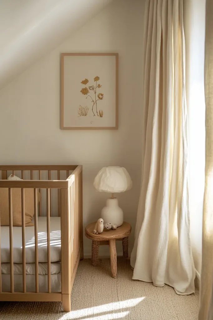
The same paint colour applied in a flat or dead-flat finish and in a satin finish reads as two different colours on the same wall. The flat finish absorbs light and makes the colour appear slightly deeper, slightly warmer, and slightly more muted. The satin finish reflects light and makes the colour appear lighter, cooler, and slightly more intense. In a nursery, where the goal is calm and the wall is a large surface experienced at close range, a flat or very low-sheen finish is almost always the correct choice — not only because of the calm register it produces, but because it is more forgiving of imperfections and easier to touch up than a sheen finish.
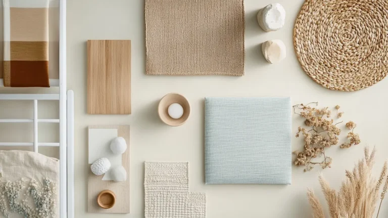
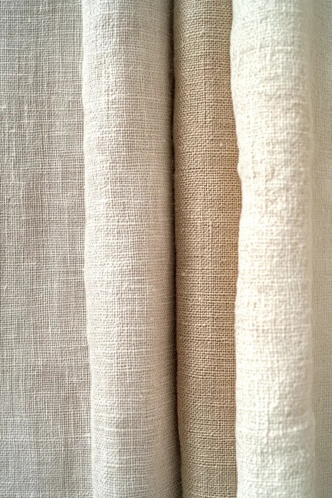
Natural textiles and colour temperature modulation
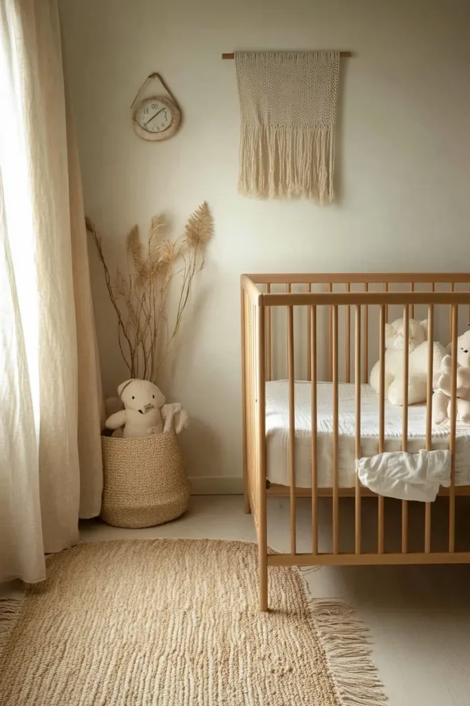
Natural textiles — linen, cotton, undyed wool, woven jute — have irregular, light-absorbing surfaces that modulate the colour temperature of the room in a way that synthetic textiles do not. A linen curtain in a warm off-white tone does not simply add a pale surface to the room; it adds a surface whose slight irregularity catches and diffuses light in a way that warms the room’s overall colour temperature. This is why natural textiles consistently read as warmer and more settled than synthetic alternatives in the same nominal colour: the texture of the material affects the way its colour interacts with the light.
The practical implication: when building a calm nursery palette, choose natural textiles over synthetic ones wherever possible, not only for material quality but for their contribution to the room’s colour environment. A synthetic fabric in the same colour as a linen will read as cooler and flatter, because its smooth, non-absorbent surface reflects rather than diffuses the light.
Wood grain and the warm foundation
Natural wood surfaces — the grain of an oak cot or dresser, the surface of a wooden floor — contribute a warm, complex colour presence that no painted surface replicates. The variation in tone across a wood grain surface is visually richer than a uniformly painted surface, and it contributes to the colour temperature of the room in a way that is consistent and warm. This is one of the reasons that natural wood furniture reads more successfully in a calm nursery than painted furniture in a similar tone: the wood’s textural variation makes it a more active and warming presence in the room’s colour environment.
→ The Art of Layering Textures in a Nursery
The Colour Errors That Most Commonly Disrupt Nursery Calm
The following errors appear consistently in nurseries that read as visually restless despite individual elements that are, taken separately, perfectly reasonable. Understanding each error makes it possible to avoid it before any purchase is made.
Error one: temperature inconsistency in the primary surfaces
The most common and most impactful colour error: a warm wall paired with a cool floor, or warm furniture placed against a cool wall. The conflict between warm and cool undertones in the room’s dominant surfaces produces the restlessness described in Section 2. The fix is to establish the temperature family before any purchases and to test every primary surface against the others. This is not about matching; it is about temperature consistency.
Error two: introducing a single strongly cool element in a warm room
A single strongly cool element in an otherwise warm room acts as a visual fault: it draws the eye repeatedly because it does not belong to the room’s temperature family. A cool grey-toned changing mat cover in a warm-toned room. A white-painted cot with a blue undertone in a room of warm woods and warm linens. A glossy white light fitting in a room of matte warm surfaces. Each of these individually might appear to be a minor detail, but in a room that is otherwise temperature-coherent, a single cool element is disproportionately disruptive.
Error three: the uniformly pale room
As described in Section 3, a room where every surface is pale and low-saturation has nowhere for the eye to rest. The visual flatness of an undifferentiated pale room is experienced as a kind of emptiness that is uncomfortable in a different way from an over-saturated room. One accent element in a slightly deeper or richer tone resolves this. The error is in applying the ‘muted’ principle so uniformly that no element has any visual weight.
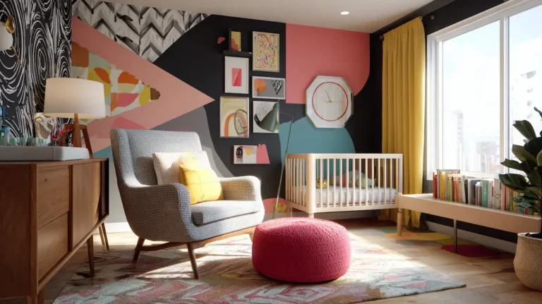
Error four: themed or novelty colours
A nursery colour palette built around a theme — a specific character, a specific set of illustrated colours — is almost always a palette built around the colours of that theme rather than around the room’s actual light, orientation, and material character. Themed palettes typically include at least one colour that would not otherwise be chosen for the room: a bright primary that is the theme character’s signature colour, a specific purple that matches the theme’s illustrated background. These theme-mandated colours frequently introduce temperature inconsistency and over-saturation simultaneously.
The practical resolution: if a theme is important, apply it in the decorative layer only — in the mobile, the print above the dresser, the embroidered cushion. The wall, the furniture, and the major textiles should belong to the room’s own palette, not to the theme’s palette.
Error five: using the same colour as the rest of the home by default
The easiest colour decision for a nursery — and often the most convenient — is to paint it the same colour as the rest of the home. This avoids the complexity of choosing a separate nursery palette and produces a room that is visually integrated with the rest of the house. The risk is that the colour chosen for the rest of the home was chosen for a different set of conditions: a larger room, different orientation, different furniture. A colour that works well in the living room may not work well in a smaller, north-facing bedroom with different furniture and less natural light. Every room deserves to have its palette considered in its own right.
→ Mistakes to Avoid When Designing a Nursery
Where to go next
Colour decisions that are grounded in temperature coherence, saturation calibration, and an understanding of the room’s light are the ones that produce calm that does not require explanation. The articles below develop the practical application of these principles in full: specific palette recommendations, the role of wall treatments, and the complete set of design decisions that colour works within.
→ The Complete Baby Nursery Design Guide
→ What Is a Nursery Style? How to Choose the Right Look
→ The Best Colour Palettes for a Baby Nursery
→ Small Nursery Layout Tips & Space-Saving Hacks
→ The Art of Layering Textures in a Nursery
→ Mistakes to Avoid When Designing a Nursery