Best Vintage-Style Wallpaper for a Parisian Interior
Wallpaper is not a default feature of the Parisian interior. The majority of well-documented Parisian apartments — particularly those in the Haussmann tradition — have flat-painted walls in warm off-white throughout. Wallpaper, when it appears, is used deliberately and sparingly: a single accent wall in a toile de Jouy, a fine stripe that reads almost as a texture, or a dark, rich tone in a study or library. Its presence is a choice, not a background.
This article covers the four wallpaper approaches most consistent with the Parisian aesthetic, the critical rule about how much wallpaper to use (and where), and specific sourcing options at different price points. All observations are based on directly visible qualities of documented Parisian interiors.
The Critical Rule: One Wall, or One Room
Before addressing any specific wallpaper type, there is a single rule that applies universally in the Parisian context: wallpaper on one wall — or in one contained room — is the correct register. Wallpaper on all four walls of a large salon reads as heavily decorated in a way inconsistent with the Parisian aesthetic of restraint. Wallpaper on a single accent wall, or throughout a smaller, more contained room (a study, a bedroom, a bathroom), reads as deliberate and considered.
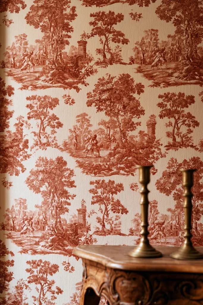
This is the specific visual logic shown in Image 4 of this article: one wall in toile de Jouy, the other three in warm off-white flat paint. The contrast between the patterned wall and the plain walls is what makes the wallpaper readable as a choice rather than as a decorating approach. Four walls in the same pattern eliminate that contrast and shift the room from Parisian to themed.
Which wall to paper
The most effective wall for a single accent is the wall that is most visible from the primary entrance to the room — typically the wall facing the doorway, or the wall behind the primary piece of furniture (the bed in a bedroom, the sofa in a salon). This is the wall the eye reaches first and rests on most frequently. A pattern on this wall has the most visual impact at the least cost (in terms of both materials and visual weight on the room).
Contained rooms: the exception
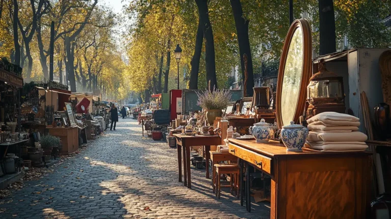
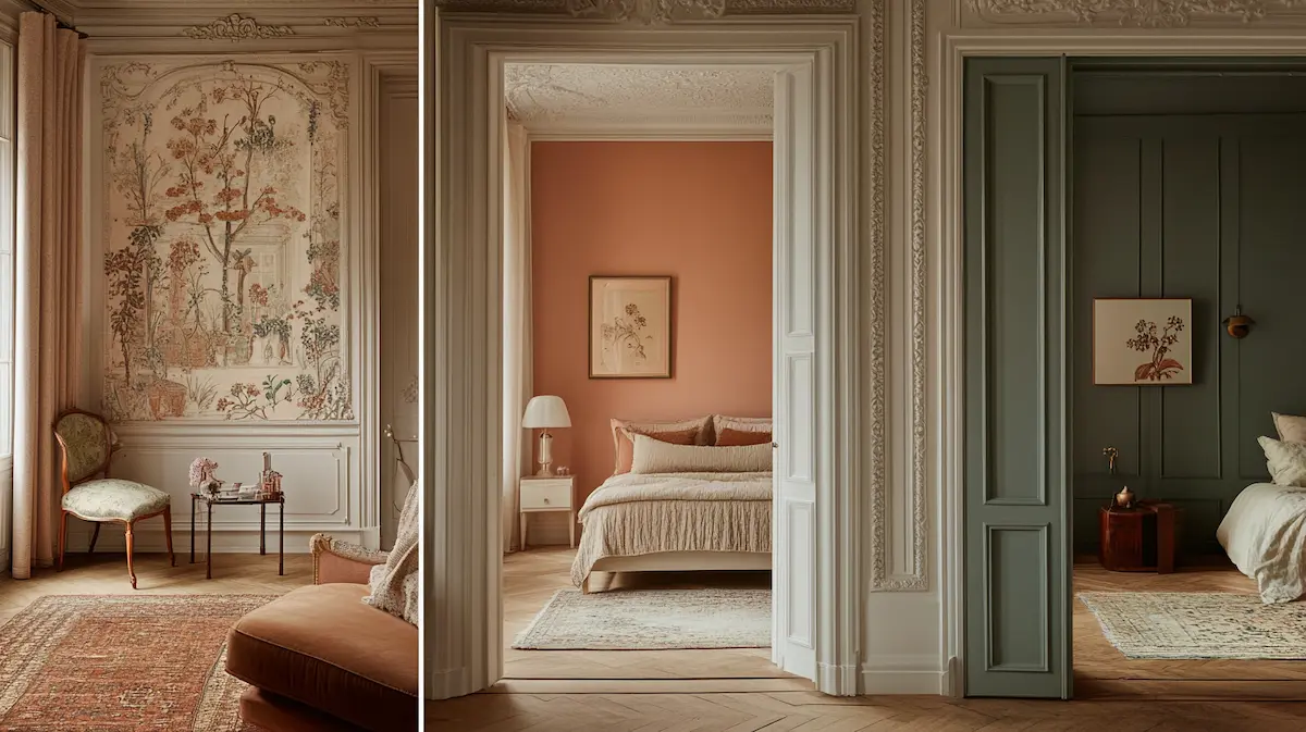
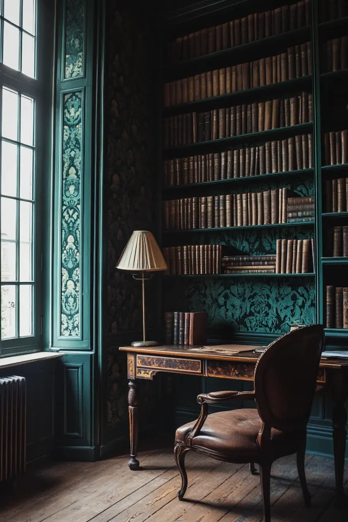
In a small, contained room — a study, a library, a dressing room, a bathroom — papering all four walls can work because the room’s scale contains the pattern rather than being overwhelmed by it. The dark-green damask study shown in Image 3 is an example of this: a relatively small room, four walls in a deep pattern, the pattern dark on dark so it reads as texture rather than print. This approach requires a specific pattern type (see Section 4) and a room scale that allows it.
→ The complete guide to Parisian vintage wall treatments: → Wall Treatments That Define Parisian Vintage Style
Type 1: Toile de Jouy — The Most Specifically French
Toile de Jouy is a cotton or linen fabric — and, in a wallpaper context, a paper printed to replicate that fabric — with a characteristic pastoral or scenic pattern: detailed illustrations of figures, animals, trees, and architectural fragments in a single colour on a light ground. The pattern is large-repeat, pictorial, and specifically 18th-century French in origin, associated with the manufacturing tradition of Jouy-en-Josas.
As a wallpaper in a Parisian interior, toile de Jouy works precisely because of its cultural specificity: it is not simply a decorative pattern, it is a French pattern, and in a Parisian interior this specificity reads as grounded rather than as themed. The distinction is the same as the one drawn in the art article: an antique map of Paris hung because it is a beautiful object of historical interest is different from a ‘Paris’ print purchased because it reads as French. Toile used as a genuine textile reference in a room of period furniture reads as authentic; toile applied to all four walls of a room that has no other period references reads as decorative.
The correct palette for Parisian toile
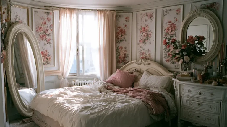
The toile colourways most consistent with the Parisian aesthetic are: terracotta on cream (the classic warm colourway, shown in Image 1), black on cream (the most graphic and contemporary-Parisian), dusty blue on cream (softer and more bedroom-appropriate), and warm red on cream (the most traditional and most specifically period-French). Saturated, vivid colourways — bright blue, emerald green, vivid pink on white — shift the toile from Parisian to graphic in a different register.
The one-wall rule in practice for toile
Toile de Jouy is the pattern type where the one-wall rule is most important. Its pictorial, large-repeat character makes it visually dominant; one wall is typically the maximum before it reads as a themed interior. Used on the wall behind a bed or behind a console, framed by plain painted walls on either side, it reads as an architectural feature — a deliberate choice of material and pattern for a specific wall.
| ➶ French Toile de Jouy Wallpaper — Vintage Countryside Scene, Removable or Paste (Etsy) |
| A French Toile de Jouy wallpaper featuring a vintage countryside pastoral scene in 18th-century style — the specific toile pattern type shown in Image 1 of this article. Available in soft blue and warm ivory tones (and other colourways on request — contact the seller). Available in removable peel-and-stick or traditional paste-required options. Eco-friendly materials. Custom dimensions available. The pastoral scene with figures and landscape elements is the classic 18th-century toile de Jouy visual vocabulary. Confirm the specific colourway available and the material options (peel-and-stick vs. paste) with the seller before ordering. Custom sizes can be arranged. Price listed in the Etsy shop — check current listing · Etsy · removable or traditional paste · custom dimensions Editorial note: For the Parisian accent wall in Image 1: order for one wall only (measure width and ceiling height; add 10% for trimming). The peel-and-stick option is appropriate for rented accommodation where wall modification is restricted; the paste option provides a more permanent, more professional finish for owned properties. For the terracotta-on-cream colourway closest to the article image, confirm colour availability with the seller — multiple colourways are typically offered on request. |
Type 2: The Narrow Stripe — The Most Versatile Parisian Pattern
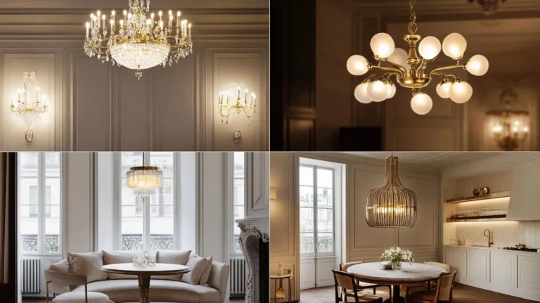
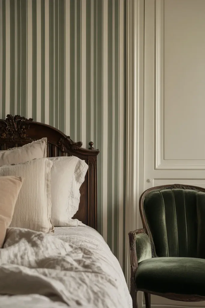
The narrow vertical stripe — two or three colours in alternating bands of 1–3 cm width — is the most versatile Parisian wallpaper type. Its visual effect at room distance is closer to a textured surface than to a bold pattern: a fine stripe in sage green and cream reads, at three metres, as a warm sage-green wall with a specific surface texture. Only at close range does the individual stripe become clearly readable.
This double quality — textural at distance, patterned at close range — is the specific quality that makes the narrow stripe work in a Parisian interior. It adds depth and warmth to a wall without imposing a bold graphic element. It also makes the ceiling appear taller, because vertical lines of any kind read as upward movement.
The correct stripe width
In the Parisian context, the stripe width that reads correctly is narrow: 1–3 cm per stripe. A bold broad stripe — 5 cm or more per band — reads as graphic and contemporary in a different register. The narrow stripe reads as period-appropriate and relates to the stripe patterns of French textile traditions: the classic mattress tick stripe, the stripe of 18th-century interior fabrics, the refined stripe of Regency-period wallpapers.
Colour choices for the stripe
The stripe colourways most consistent with the Parisian aesthetic: sage green and cream (the combination shown in Image 2), warm grey and cream, dusty rose and cream, and the classic navy and cream of the French maritime tradition. The warm tone should be the stripe; cream should be the ground. A stripe in which both colours are equally saturated reads as bolder and more graphic; a stripe in which the warm colour is muted and the ground is warm cream reads as closer to the period quality.
| ➶ Sage Green Striped Wallpaper — Peel and Stick or Traditional, OEKO-Tex (Etsy) |
| A sage green vertical stripe wallpaper available in peel-and-stick (polyester fabric) or traditional non-woven matte paper options — the narrow stripe type shown in Image 2 of this article. OEKO-Tex certified and FSC certified. PVC-free. B1/M1 fire resistance rating. Printed with eco-solvent inks. The soft sage green brings a botanical, vintage quality to the wall, reading almost as a texture at room distance. Available in custom sizes. Important installation note from the seller: peel-and-stick should not be applied to textured walls; smooth, clean walls only. Wait a minimum of 4 weeks after painting before application. Price listed in the Etsy shop — check current listing · Etsy · peel-and-stick or traditional · OEKO-Tex · PVC-free |
| → Graham & Brown — Vintage-Style Stripe and Classic Wallpapers |
| Graham & Brown is a UK wallpaper brand with a consistently well-curated range of traditional stripe and period-pattern wallpapers, including narrow pinstripe wallpapers in sage, cream, and warm grey colourways that read as period-appropriate in a Parisian context. The Boutique, English Heritage, and Laura Ashley ranges within their collection contain the stripe types most relevant to this article. Available in standard rolls (10 m × 52 cm), paste-the-paper and paste-the-wall options. Ships across Europe and internationally. No affiliate relationship — included because Graham & Brown provides one of the most accessible and widely distributed routes to correctly specified traditional stripe wallpaper in Parisian-appropriate tones. From approx. £18 per roll · Via Graham & Brown |
Type 3: The Dark Accent — Depth in a Study or Library
The dark wallpaper — in deep teal-green, forest green, navy, or warm charcoal — with a subtle repeat pattern (damask, botanical, small floral) is the third wallpaper type consistent with the Parisian aesthetic, and the one that produces the most dramatically different result from a painted wall. Used on all four walls of a small, contained room, it creates the specific quality of the Parisian bibliothèque or cabinet de travail: a room that is unmistakably for thinking and reading, warm and enveloping, the bookshelves and aged wood furniture reading as warm against the dark, rich ground.
The critical quality of a dark Parisian wallpaper is that the pattern reads as texture rather than print. A dark damask where the pattern is dark on dark — a deeper shade of the same colour on the base tone — produces a surface that reads from a distance as a rich, slightly complex painted surface, and only reveals its pattern on close inspection. This is the quality shown in Image 3.
The tone: warm green, not cool grey
The dark tones most consistent with the Parisian study aesthetic are warm rather than cool: deep teal-green (with yellow undertones, not blue), forest green, or a warm dark indigo. Cool grey-based darks — slate grey, blue-grey, cold charcoal — read as contemporary in a different register. The warmth of the tone is what allows aged wood furniture, brass lamp fittings, and leather seating to read comfortably against the wall.
The cornice and baseboard in a dark room
In a room with dark walls, painting the cornice and baseboard in the same dark tone produces the most dramatic and most specifically Parisian result: the room reads as a continuous dark envelope. Painting the cornice in white while the walls are dark produces a harder visual break at the ceiling that reads as more contemporary. Both are valid choices; the all-dark envelope is the more committed and more period-appropriate option.
| ➶ Dark Green Damask Wallpaper — Vintage Baroque, Star Seller (Etsy) |
| A dark green vintage baroque damask wallpaper from an Etsy Star Seller — the deep forest green pattern type shown in Image 3 of this article. Default colour is Dark Forest Green; other options (Vintage Vogue, Vintage Blue, Gold, Vintage Cream) available by specifying in the personalisation box at checkout. Pattern repeat: 28 inches. Available as peel-and-stick or traditional vinyl. Custom sizes available. Star Seller status confirms consistently 5-star reviews, on-time shipping, and quick communication. Buyers specifically mention the moody quality and the quality of the canvas material. Price listed in the Etsy shop — check current listing · Etsy · Star Seller · Dark Forest Green default · custom size |
Type 4: The Subtle Texture — Wallpaper That Reads as Paint
The fourth wallpaper type is the subtlest and the most widely applicable: a small-scale, tonal pattern — a damask in stone on stone, a small geometric in cream on cream, a very fine botanical in warm grey on off-white — where the pattern is barely visible at room distance and reads as a warm, slightly complex painted surface rather than as a wallpaper. This type is particularly useful for rooms where the artwork and furniture are already doing significant visual work and the wall needs to contribute texture and warmth without adding further visual complexity.
The subtle texture wallpaper is shown in Image 6 of this article: a very faint small-scale damask in warm stone, visible only at close range, reading as a textured wall at normal viewing distance. The artwork in front of it reads more richly against this surface than it would against a plain painted wall, because the slight texture of the wallpaper adds visual depth without competing.
Where it works
The subtle texture type works in any room in a Parisian interior but is particularly effective in: the salon where the primary wall carries a significant art arrangement (the wallpaper provides the ground without competing), the bedroom where the goal is warmth rather than pattern, and the hallway where a textured surface adds interest to a narrow space without making it feel more enclosed.

| → Cole & Son — Subtle Damask and Texture Wallpapers |
| Cole & Son is a British wallpaper house with archive-based designs that include several directly applicable subtle texture and small-scale damask patterns in the warm stone, cream, and off-white register most appropriate for the Parisian context. The Palladio, Archive Anthology, and Soane collections contain patterns in this register. Available through Cole & Son’s website and through interior design retailers internationally. No affiliate relationship — included because Cole & Son provides the most consistent reference for the specific quality of subtle pattern and tonal wallpaper described in this section at a premium quality level. From approx. £38 per roll · Via Cole & Son · https://www.cole-and-son.com/en/wallpaper/all-wallpaper Editorial note: Filter by colour (cream, off-white, stone, warm grey) and by style (damask, geometric, classic) for the most directly applicable options. Order a sample before committing — the subtle pattern quality of this type is best assessed in the actual room’s light rather than from a screen image. Cole & Son samples are available through their website or via trade stockists. |
The Accent Wall in Practice: Using Wallpaper Without Overpowering
The specific Parisian approach to wallpaper use — one wall, one room — requires a practical understanding of how to integrate the papered wall with the plain walls around it. The transition between the two needs to be handled correctly to read as deliberate rather than as unfinished.
Matching the plain wall tone to the paper
The plain walls adjacent to a papered accent wall should be painted in a tone that relates to the paper’s ground colour rather than in a contrasting tone. If the toile paper has a warm cream ground, the adjacent walls should be in the same warm cream or a very slightly cooler off-white — not in a different colour. The relationship between the papered wall and the plain walls should be one of texture and pattern, not one of colour contrast.
The lambrisering combination
One of the most elegant and most specifically Parisian approaches to wallpaper use is the combination of a painted dado rail and wallpaper above it, shown in Image 5. In this arrangement, the wall below the dado rail (at approximately 90–100 cm from the floor) is painted in a single colour — often the same tone as the wallpaper’s ground, or a slightly deeper tone. The wallpaper runs from the dado rail to the cornice above. This arrangement has the effect of making the room’s lower half read as architectural and grounded, while the upper half provides the pattern or texture. It also reduces the amount of wallpaper needed, which is practical for expensive patterns.

| → Farrow & Ball — Wallpaper in Parisian-Register Tones and Patterns |
| Farrow & Ball produces wallpaper in their characteristic range of warm, complex tones — including several stripe and small-pattern designs directly applicable to the Parisian context. The Tented Stripe, Closet Stripe, and Block Print Stripe designs, particularly in the warm, muted Farrow & Ball colourways (Mizzle, Card Room Green, Pea Green, Elephant’s Breath), are the most consistent with the Parisian stripe aesthetic. The papers are all paste-the-wall non-woven, designed to be matched with Farrow & Ball paints for the adjacent walls. Available internationally through the Farrow & Ball website and stockists. No affiliate relationship — included because Farrow & Ball provides the most accurately documented reference for the specific tone and surface quality of a correctly specified Parisian stripe wallpaper. From approx. £120 per roll · Via Farrow & Ball Editorial note: Use Farrow & Ball wallpaper as the quality and tone reference even if the price point is beyond the immediate budget. The specific warm, muted quality of their stripe colourways — particularly Card Room Green and Mizzle — is the closest available reference to the sage-green narrow stripe shown in Image 2. Pair with the matching Farrow & Ball estate emulsion on the adjacent walls in a very slightly lighter tone of the same colour for the most integrated wall treatment. |
Peel and Stick vs. Traditional Paste: What to Know
Most of the Etsy wallpaper listings in this article are available in both peel-and-stick (self-adhesive) and traditional paste-required formats. The choice depends on the permanence required and the surface to which the paper will be applied.
Peel and stick: advantages and limitations
Peel-and-stick wallpaper adheres to smooth, clean, dry wall surfaces without paste. It is removable without wall damage when applied to correctly prepared surfaces, which makes it appropriate for rented accommodation. The main limitations: it should not be applied to textured surfaces (rough plaster, brick, heavily textured paint), and it requires a clean, smooth wall that has been painted with a non-scrubbable flat paint and allowed to cure fully (typically 4 weeks after painting). The adhesive quality varies between products; the better Etsy sellers are explicit about surface requirements in their listings.
Traditional paste: more permanent, more forgiving
Traditional paste-the-wall or paste-the-paper wallpaper is more forgiving of minor wall imperfections and produces a more permanent finish. Non-woven paste-the-wall papers (where the paste goes on the wall rather than the paper) are the easiest DIY option in the traditional format. They do not expand when wet, which eliminates the pattern-matching problems that can occur with paste-the-paper formats.
Surface preparation
Regardless of format, wall surface preparation is the most important factor in wallpaper adhesion and appearance. A smooth, dry, clean surface that has been painted with a flat primer or flat paint — not a washable or scrubbable paint — is the correct base for both peel-and-stick and traditional paper. For walls with significant imperfections or old wallpaper residue, a skim coat of filler and sanding before application significantly improves the result. For anyone unfamiliar with wallpaper installation, consulting the seller’s specific instructions before ordering and before starting is the most practical approach.
“Wallpaper in a Parisian interior is a choice, not a default. One wall, correctly chosen and correctly placed, does more than four walls of the same pattern.”
→ How the Parisian wall palette relates to the overall colour vocabulary: → The Essential Color Palette for Parisian Vintage Interiors
→ The historical context of wall treatments in the Parisian interior: → The History of Parisian Interior Style (From Haussmann to Now)
→ The sofa that will sit against your papered accent wall: → Best Vintage-Style Sofas for a Parisian Living Room
→ The coffee table in front of the accent wall: → Best Parisian-Style Coffee Tables (Vintage & New)