
How Materials Create Calm: The Hidden Structure of Crafted Minimalist Interiors
Calm is often mistaken for a visual style. White walls, empty surfaces, minimal furniture. But in reality, calm is not something you see first — it is something you feel. It is a physiological response to an environment that does not demand constant attention.
Interiors that feel calm do not rely on emptiness. They rely on materials that behave predictably and gently. Surfaces that absorb light instead of reflecting it. Textures that feel stable rather than sharp. Materials that age slowly and consistently, without sudden visual disruption.
This is why many minimalist interiors fail to feel calm. They focus on reduction instead of response. They remove objects, but leave behind materials that are glossy, rigid, or visually active. The result may look clean, yet still feel tense.
In Crafted Minimalism, calm is built through material decisions, not styling choices. Materials shape how the eye moves, how the body anticipates touch, and how the mind interprets space. When these signals align, calm follows naturally — without needing decoration or explanation.
Understanding calm as a response rather than an aesthetic is the first step toward creating interiors that truly feel settled.
Disclaimer: This post may contain affiliate links. That means if you click and purchase through one of these links, we may earn a small commission — at no extra cost to you. As an Etsy affiliate and Amazon Associate, I earn from qualifying purchases. We only recommend products we truly love or believe fit the style of our AI-generated designs.
How the brain responds to materials

Our brains are constantly scanning environments for signals: safety, effort, unpredictability. Materials play a central role in this process. Long before we consciously register a style, the brain interprets surfaces through light behavior, texture, and repetition.
Matte materials tend to calm the nervous system because they reduce visual feedback. They absorb light instead of bouncing it back, which lowers contrast and slows eye movement. Glossy or reflective surfaces do the opposite. They create micro-highlights that the brain keeps tracking, subtly increasing alertness even in quiet spaces.
Texture also matters. Irregular, natural textures—like wood grain, stone variation, or woven fibers—give the brain something to rest on. They are complex, but not demanding. Perfectly uniform surfaces, on the other hand, often feel artificial. The brain reads them as controlled and slightly tense, because they don’t behave like anything found in nature.
Repetition amplifies these effects. When a space relies heavily on one highly reflective or highly uniform material, the brain has no place to pause. Calm interiors distribute visual information more evenly, allowing attention to soften.
This is why certain materials consistently feel calming across cultures and styles. It’s not preference — it’s perception. When materials behave gently, the brain follows.
Visual calm: reducing cognitive load through material choice
Visual calm has little to do with how empty a space looks and everything to do with how much work the eye is asked to do. Cognitive load refers to the amount of visual information the brain must continuously process. When materials create constant contrast, reflection, or repetition, that load increases—even if the room appears minimal.
Materials with soft variation reduce this load. Natural wood grain, stone with subtle mineral shifts, and textiles with irregular weave patterns give the eye complexity without direction. The gaze doesn’t need to follow sharp lines or repeated highlights; it can pause. This is where calm begins.
Highly polished surfaces do the opposite. They fragment attention by reflecting light unevenly. The brain keeps scanning, adjusting, and correcting. Over time, this creates low-level tension that often gets misinterpreted as “the space feels off.”
This is why calm interiors are not necessarily sparse. They are visually considerate. Materials are chosen for how quietly they behave together, not for how little there is to look at. This idea is explored further in Creating Calm Without Emptiness, where restraint is framed as balance rather than absence.
When materials reduce cognitive load, the room feels easier to be in—without needing explanation.
Tactile calm: why touch matters even when you’re not touching

Calm is not only visual. Even when we don’t physically touch surfaces, the brain constantly anticipates touch. This anticipation shapes how safe, relaxed, or tense a space feels. Materials signal whether they would feel warm or cold, soft or hard, forgiving or rigid — long before contact happens.
Natural materials tend to communicate comfort through familiarity. Wood suggests warmth and slight give. Linen and wool imply softness and breathability. Stone feels solid and stable. These signals reassure the body, lowering unconscious alertness. Synthetic materials often do the opposite. They appear sealed, slippery, or overly perfect, creating distance rather than ease.
Tactile expectation also influences posture and behavior. In spaces filled with materials that look hard or fragile, people move more carefully. Shoulders tense. Movements become restrained. Calm interiors allow the body to relax because the materials appear tolerant of use.
This is why tactile calm matters even at a distance. When materials look like they will respond gently to life, the body settles. Crafted Minimalism relies on this effect. It chooses materials that invite presence rather than demand caution — creating spaces that feel livable, grounded, and emotionally safe.
My material philosophy: how I choose materials for calm interiors

When I choose materials for calm interiors, I’m not looking for visual softness alone. I’m looking for behavior over time. Calm only lasts when materials remain readable, forgiving, and consistent as they age.
My first criterion is light behavior. Materials must absorb or diffuse light rather than reflect it sharply. Matte wood, stone with subtle mineral variation, and textiles with visible weave reduce visual tension and prevent glare from becoming a constant distraction.
Second is aging. I choose materials that change gradually and coherently. Raw wood deepens, linen softens, stone holds its tone. I avoid finishes that look pristine until they suddenly don’t. Abrupt wear breaks calm.
Third is texture without pattern. Texture should be embedded in the material itself, not applied through graphics or ornament. Natural irregularity gives the eye something to rest on without asking it to decode information.
Finally, I consider compatibility. Materials must work together without hierarchy. If one material dominates or demands correction through styling, it doesn’t belong. Calm interiors rely on material cooperation, not contrast.
These principles guide every product I select. The goal is not expression, but reliability—materials that quietly support everyday life without needing constant attention.
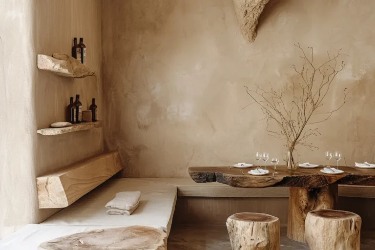
Raw wood furniture with visible grain

Raw wood furniture consistently creates calm because it introduces direction without urgency. Visible grain gives the eye something to follow, but not something it has to solve. This gentle movement slows perception instead of stimulating it. That is why I deliberately choose raw wood pieces where the grain is present, irregular, and uninterrupted by heavy finishes.
I avoid high-gloss coatings or overly uniform stains. These flatten the surface and turn wood into a visual sheet rather than a living material. What works instead are lightly treated woods—oiled, brushed, or minimally sealed—where variation remains legible. Knots, subtle color shifts, and grain direction all contribute to a surface that feels stable yet alive.
I personally select raw wood furniture for pieces that are touched daily: tables, benches, shelving. The material communicates warmth and tolerance. It doesn’t ask for caution. Over time, it deepens rather than degrades, reinforcing calm through familiarity instead of novelty.
This makes raw wood a foundational material for interiors that aim to feel settled rather than styled.
This live-edge suar wood dining table set brings visible grain, natural edges, and material weight together into a surface that feels grounded rather than designed.
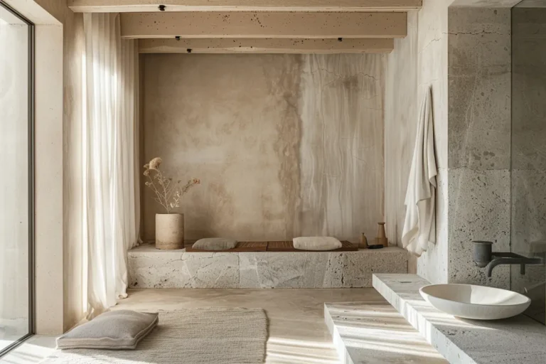
Natural stone surface or table
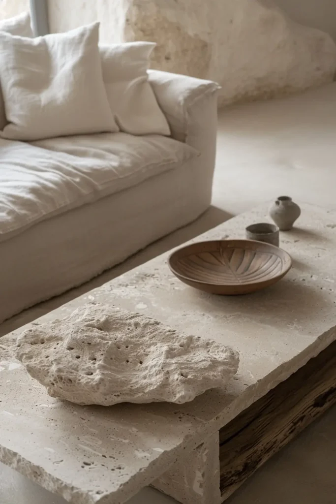
Natural stone creates calm through weight and visual stillness. Where wood introduces gentle movement, stone slows everything down. I choose stone surfaces or tables because they act as anchors within a space. The eye rests on them instead of moving across them, which immediately reduces visual urgency.
I specifically look for stone with subtle mineral variation rather than dramatic veining. Travertine, limestone, or softly textured marble work best because they remain readable without becoming expressive. Highly polished finishes are something I avoid; they introduce reflection and pull attention forward. A honed or lightly brushed surface keeps the stone quiet and tactile.
Stone works particularly well in areas where visual stability matters: coffee tables, dining tables, or consoles. Its physical mass communicates permanence. It doesn’t shift, shimmer, or demand adjustment. Paired with raw wood or natural textiles, stone balances warmth with stillness, creating an interior that feels grounded rather than heavy.
This is why stone is a reliable material choice when calm needs structure.
This 19th-century stone table introduces visual stillness and quiet weight, grounding the space through material rather than form.
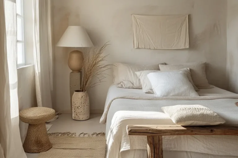
Linen or wool upholstered seating

Linen and wool upholstery create calm by softening edges without dissolving structure. I choose these materials because they absorb light, dampen sound, and signal comfort before you ever sit down. Unlike smooth or technical fabrics, linen and wool introduce texture that feels stable rather than decorative.
Linen works especially well on larger seating pieces. Its natural creasing and visible weave prevent sofas from feeling rigid or overdesigned. Wool, on the other hand, adds density and resilience. It holds shape while remaining tactile, making it ideal for chairs or cushions that see daily use.
I avoid synthetic blends and overly tight weaves. These tend to reflect light and feel sealed, which increases visual tension. What works instead are natural fibers with slight irregularity—materials that tolerate use and age gradually.
Placed alongside raw wood and stone, linen or wool upholstery completes the material balance. The space feels quieter, warmer, and easier to inhabit, without relying on layers or styling to create softness.
This lounge chair combines soft upholstery and grounded form, offering comfort that feels calm rather than styled.
Ceramic statement piece as a visual pause

A ceramic statement piece creates calm by introducing a deliberate pause in the material rhythm of a space. I choose ceramics here not as decoration, but as a moment of stillness that interrupts continuous surfaces of wood, stone, or fabric without adding contrast.
What matters most is restraint. The form should be closed and grounded, with a matte or softly mineral glaze that absorbs light. Subtle irregularities—slight asymmetry, glaze variation, hand-thrown texture—signal human scale without turning the object into an expressive focal point.
Placed alone on a table, console, or shelf, a ceramic piece slows perception. It gives the eye a place to rest and reduces the need for additional objects. In this way, ceramics don’t compete with other materials; they complete them—adding calm through material honesty rather than visual emphasis.
Common mistakes: materials that look calm but feel tense
Many interiors look calm at first glance but feel subtly tense once you spend time in them. The issue is rarely layout or color — it’s material behavior. One common mistake is relying on materials that are too smooth or reflective. High-gloss finishes, polished stone, or sealed synthetics create constant micro-highlights that keep the eye scanning, even in otherwise minimal spaces.
Another mistake is over-uniformity. When everything shares the same flawless surface or identical texture, the space becomes visually rigid. The brain reads this as controlled rather than relaxed. Calm requires variation that doesn’t demand attention.
Contrast can also be misused. Sharp transitions between materials — very dark next to very light, rough next to ultra-smooth — introduce friction. Instead of balance, the space feels segmented.
Finally, too many “calm” materials at once can overwhelm. Layering wood, stone, linen, wool, and ceramics in one zone without hierarchy turns restraint into accumulation.
True calm comes from material clarity, not from piling on softness or neutrality.
How to apply calm materials in real homes

Applying calm materials successfully is less about following rules and more about assigning materials to the right roles. In real homes, materials must support daily life before they support aesthetics. Calm emerges when materials are placed where they naturally make sense.
In living areas, heavier materials like stone or ceramic work best at low or static points — coffee tables, side tables, consoles. They anchor the space and reduce visual movement. Lighter, tactile materials such as wood and upholstery should appear where people interact most: seating, tabletops, armrests.
In dining spaces, wood often becomes the primary touch surface, while stone or ceramics add stability nearby. This prevents the room from feeling either too soft or too rigid. Entryways and transitional spaces benefit from grounding materials as well. A single stone or ceramic element can slow the transition between rooms without adding clutter.
The key is limitation. One dominant material per zone is often enough. Calm interiors don’t layer endlessly — they distribute responsibility. When each material has a clear role, the space feels intuitive, settled, and easy to live with.
Calm is built, not styled
Calm does not appear at the end of the design process. It is not something you add once everything else is finished. Calm is built slowly, through material decisions that support the way a space is used and perceived.
When materials absorb light, soften sound, and age gradually, the interior stops demanding attention. The eye rests more easily. The body relaxes. The space feels reliable rather than controlled. This is why calm interiors rarely depend on emptiness or decoration — they depend on how materials behave together over time.
In Crafted Minimalism, materials are not chosen for effect, but for consistency. Raw wood, stone, natural textiles, and ceramics each carry a specific role. When those roles are respected, the interior settles into itself. There is less need for correction, layering, or constant adjustment.
This approach aligns closely with the idea explored in Creating Calm Without Emptiness: calm does not come from removing life, but from supporting it quietly. When materials do their work well, the space no longer needs to explain itself. It simply feels right.