Color Palettes for Crafted Minimalism: Calm Through Restraint
Color as structure, not decoration
In many minimalist interiors, color is treated as an afterthought. Walls are painted white, accents are added later, and calm is expected to emerge automatically. But within Crafted Minimalism, color plays a very different role. It is not decoration — it is structure.
Color influences how materials are perceived, how light moves through a space, and how long the eye lingers. A neutral tone on raw wood behaves differently than the same tone on plaster or ceramic. In Crafted Minimalism, color is always tied to material. It supports form, texture, and weight rather than competing with them.
This is why color palettes in this style are intentionally restrained. Not because color is avoided, but because it is used precisely. Subtle shifts within the same tonal family create depth without distraction. The goal is not visual interest for its own sake, but continuity — a palette that feels coherent from morning light to evening shadow.
Understanding color as structure changes how interiors feel. Instead of drawing attention, color stabilizes the space. It allows materials to speak quietly, creating calm that lasts beyond first impressions.
Why color behaves differently in Crafted Minimalism
Color never exists on its own. In Crafted Minimalism, color is inseparable from material, texture, and light. The same shade can feel calm or restless depending entirely on what it sits on and how it reacts to daylight.
A warm beige on raw wood appears soft and grounded because the grain breaks the color into subtle variation. The same beige on a smooth, synthetic surface can feel flat or artificial. Stone absorbs color differently again, muting saturation and slowing visual movement. This is why Crafted Minimalism avoids “perfect” paint colors or trend-driven tones. Perfection removes nuance — and nuance is where calm lives.
Light plays an equally important role. Natural light changes color throughout the day, and materials that accept this change feel alive rather than unstable. Matte finishes diffuse light gently, allowing colors to deepen or soften without glare. Glossy finishes freeze color in place, making it feel rigid and overly controlled.
This is also why color palettes in Crafted Minimalism remain narrow. Not to limit expression, but to allow materials to carry variation naturally. Color supports the material instead of competing with it — creating interiors that feel consistent, settled, and emotionally quiet across time.
Neutral does not mean boring
Neutral colors are often misunderstood as safe, empty, or unimaginative. In reality, neutrality in Crafted Minimalism is anything but flat. What makes a neutral palette work is depth created through material and tonal variation, not contrast or accent colors.
A single neutral tone can appear in dozens of ways depending on surface and texture. On linen, it feels soft and breathable. On raw wood, it gains warmth and direction through grain. On stone or plaster, it becomes quieter and heavier. This layered behavior is what keeps neutral palettes visually engaging without becoming demanding.
Problems arise when neutrals are treated as paint swatches rather than spatial tools. Cool greys, stark whites, or overly clean beiges often strip away material nuance, making spaces feel clinical instead of calm. Crafted Minimalism avoids these extremes by staying close to natural reference points—sand, clay, limestone, weathered wood.
When neutrals are chosen with restraint and material awareness, they create continuity rather than emptiness. This approach is explored more deeply in Neutral Colors That Aren’t Boring, where neutrality becomes a framework for calm instead of a lack of personality.
Earth tones as the backbone of Crafted Minimalist palettes
Earth tones form the quiet foundation of Crafted Minimalism because they are inherently familiar. These colors don’t need explanation. They reference materials and landscapes we instinctively recognize: clay, sand, limestone, aged wood. Because of this, the eye accepts them quickly, and the body relaxes.
What matters is not using earth tones broadly, but using them precisely. Warm earth tones soften a space when they appear in matte finishes and natural materials. Cooler earth tones—like stone grey or muted olive—add structure when used sparingly and anchored by texture. Problems arise when earth tones are flattened into paint-only applications or pushed too dark, losing their mineral quality.
In Crafted Minimalism, earth tones rarely act as contrast. Instead, they work as a spectrum. Slight shifts between warm and cool, light and mid-tone, create depth without visual interruption. This is why these palettes feel grounded rather than styled.
A deeper exploration of how these tones function across different materials can be found in Earth Tones in Crafted Minimalism, where color is treated as an extension of material behavior rather than decoration.
My approach: how I personally build a Crafted Minimalist palette

When I build a color palette for a Crafted Minimalist interior, I don’t start with colors — I start with materials and light. Color only comes in once I understand how a space behaves throughout the day. Morning light, evening shadows, and artificial light all change how a tone reads, especially on natural surfaces.
My first rule is to avoid extremes. I rarely use pure white or true black. These colors tend to flatten materials or create unnecessary contrast. Instead, I work within a narrow range of warm neutrals and earth tones that can shift subtly without breaking cohesion.
Second, I assign roles. One dominant tone anchors the space. One or two supporting tones add depth. Everything else stays quiet. This prevents palettes from becoming decorative or busy. Calm comes from repetition with variation, not from mixing.
Finally, I always test colors on material, not on paint chips alone. A tone that looks perfect on paper can feel lifeless on the wrong surface. In Crafted Minimalism, color only works when it belongs to the material it lives on.
This approach ensures palettes feel grounded, timeless, and resilient — not trend-driven or fragile.
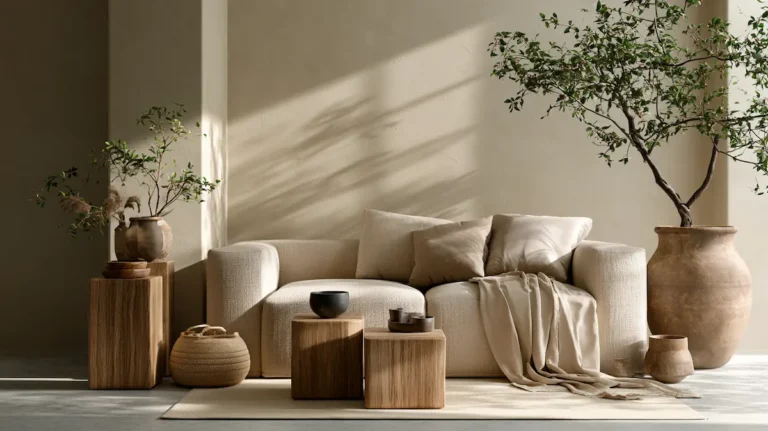
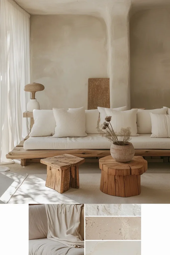
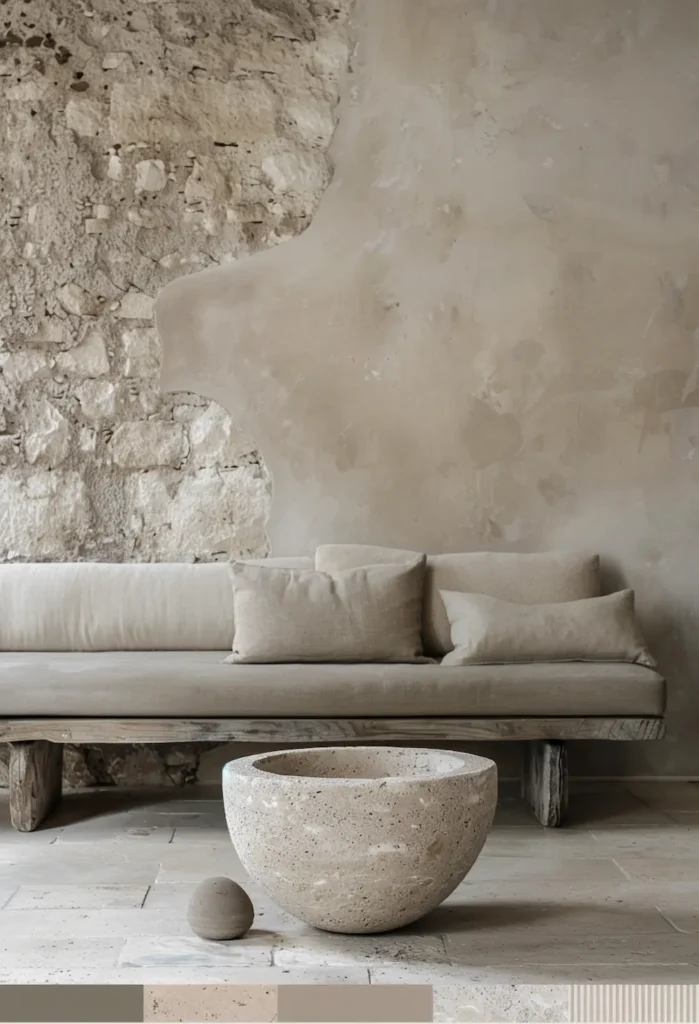
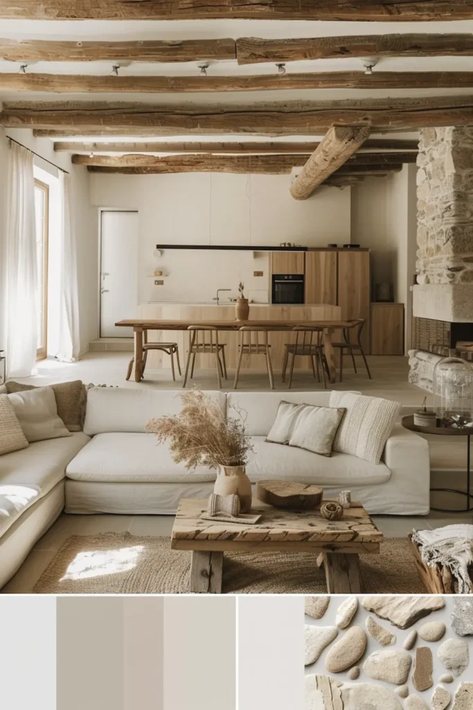
Upholstery in warm neutral tones

Upholstery is often where color mistakes become most visible. Large surfaces amplify tone, texture, and contrast. That is why, within Crafted Minimalism, I deliberately choose warm neutral upholstery rather than cool greys or stark whites.
Warm neutrals—think soft sand, muted oatmeal, light clay—interact gently with light. They absorb rather than reflect, allowing shadows to soften instead of sharpening edges. On natural fabrics like linen or wool, these tones gain depth through weave and fiber, preventing the surface from feeling flat or sterile.
What matters most is restraint. The upholstery should not introduce a new color story; it should stabilize the existing palette. This makes seating feel grounded rather than styled. Over time, these tones age gracefully. Minor wear blends into the material instead of standing out.
I personally select upholstered pieces where the color feels inseparable from the fabric itself. No artificial tinting, no cold undertones. When done right, warm neutral upholstery becomes a quiet anchor — supporting calm without asking for attention.
This armchair balances soft upholstery and calm proportions, offering a warm neutral presence that supports the palette rather than leading it.
The furniture pieces that carry these tones are explored in more depth in Crafted Minimalist Furniture Essentials.
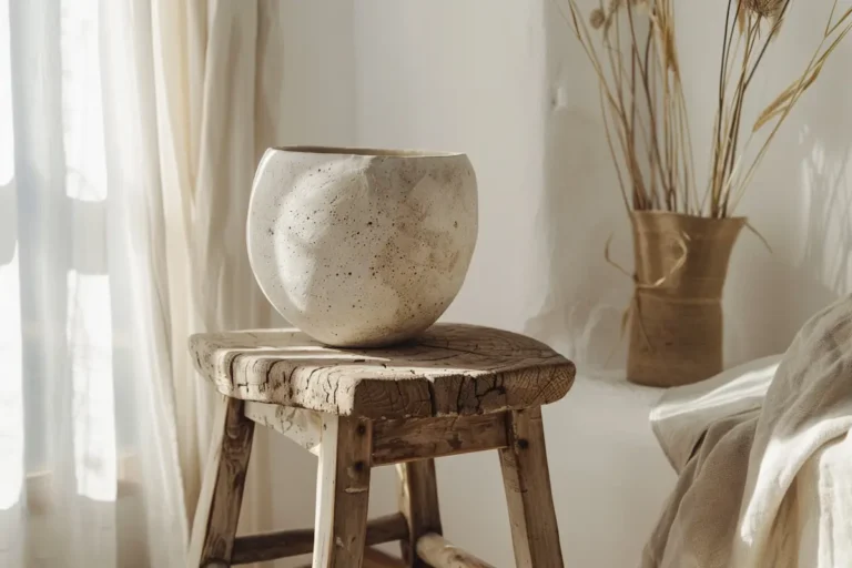
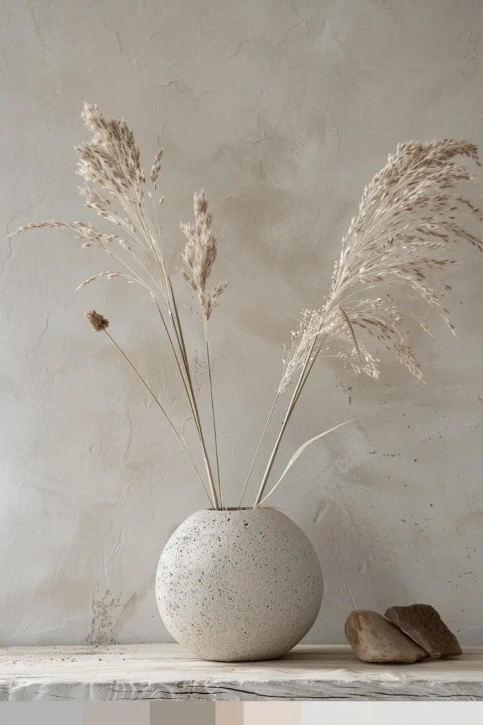
Stone or ceramic piece in muted earth tones
Stone and ceramic pieces play a different role than upholstery or wood. They don’t soften a space — they slow it down. This is why I introduce them selectively, usually as a single, grounded object rather than a repeated material.
Muted earth tones are essential here. Think limestone, pale travertine, soft clay, or mineral grey. These tones carry weight without darkness. On stone or ceramic, color appears quieter than on paint or fabric, because the material itself absorbs variation. The result is visual stillness rather than emphasis.
I look for pieces where the color feels inseparable from the material — no high-gloss finishes, no dramatic veining, no decorative shaping. The object should read as solid and resolved, not expressive. This makes it ideal for coffee tables, side tables, or sculptural vessels that anchor a room without competing with other materials.
When paired with warm wood and soft textiles, a muted stone or ceramic piece introduces calm through contrast in behavior, not contrast in color.
This cement bowl introduces visual weight and muted texture, grounding the space through material rather than decoration.
Bathroom element in a restrained neutral palette
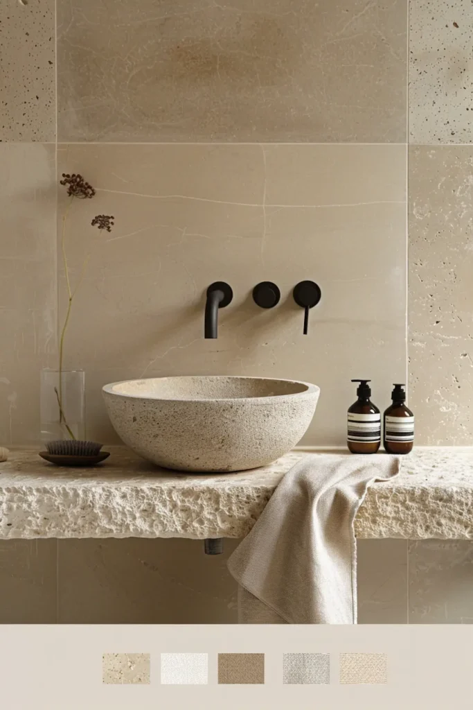
Bathrooms are one of the most sensitive spaces when it comes to color. Hard surfaces, artificial light, and frequent use amplify every choice. This is why, within Crafted Minimalism, I work with restrained neutral palettes rather than bright whites or cool greys.
Soft neutrals—warm off-white, pale stone, light clay—create a sense of cleanliness without sharpness. On materials like stone, ceramic, or plaster, these tones feel calm because they absorb light instead of reflecting it harshly. The space reads quieter, even when functional elements are present.
I deliberately choose bathroom elements where color feels embedded in the material itself. A sink, basin, or accessory in a muted neutral tone should feel solid and permanent, not decorative. Glossy finishes or high contrast immediately introduce tension in a room meant for slowing down.
When done well, a restrained neutral bathroom element doesn’t stand out. It stabilizes the space. It allows water, light, and daily routines to exist without visual friction—turning the bathroom into a place of pause rather than stimulation.
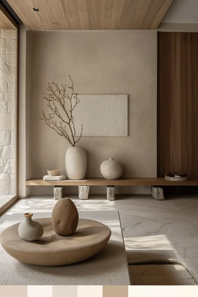
Accent object with a modern edge
An accent object with a modern edge only works in Crafted Minimalism when it respects the existing palette. This is not the place for bold color or expressive form. Instead, the object introduces a slight shift in tone or finish—enough to add tension, not enough to disrupt calm.
I look for pieces where modernity comes from precision, not contrast. Think a darker neutral ceramic, a subtly cooler stone, or a refined metal detail with a matte finish. The color should sit one step outside the core palette, never outside the material language of the space.
What makes these objects effective is restraint. They are used once, not repeated. They appear where the eye naturally pauses—a console, a shelf, a side table—adding depth without creating a focal point. Their role is to sharpen the calm, not to decorate it.
This is where Crafted Minimalism allows a contemporary note to enter, without shifting into trend-driven design. When chosen carefully, a modern accent object reinforces structure, clarity, and confidence—proving that calm does not require softness alone.
Common color mistakes in minimalist interiors
Many minimalist interiors fail not because of too much color, but because of poor color decisions disguised as neutrality. One of the most common mistakes is relying on cool greys as a universal solution. While they appear calm at first, they often drain warmth from natural materials, making spaces feel flat or emotionally distant.
Another frequent issue is excessive contrast. Stark white walls paired with dark accents may look clean, but they fragment the space visually. The eye keeps jumping between extremes instead of settling. Calm requires continuity, not sharp division.
Overusing accent colors is another trap. Even muted accents become disruptive when they appear without a material reason. Color should emerge from the material itself, not sit on top of it.
Finally, many interiors treat color as static. They ignore how light shifts throughout the day. A palette that looks balanced at noon can feel harsh in the evening if tones are too cold or too reflective.
Crafted Minimalism avoids these pitfalls by treating color as a supporting structure, not a visual statement.
Applying color palettes room by room
Color palettes only work when they are adapted to how a room is used. Crafted Minimalism does not apply one fixed palette everywhere; it adjusts tone density and material emphasis per space while keeping the overall language consistent.
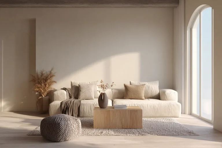
In living rooms, warmer neutrals work best. This is where the body rests, so tones like soft sand, light clay, and warm off-white create ease without dullness. These colors should appear on large surfaces—walls, upholstery, rugs—allowing smaller material variations to do the work.
Kitchens and dining spaces can handle slightly cooler or heavier tones, especially when balanced with wood. Stone greys, muted taupe, or pale mineral shades add structure and clarity without becoming sterile.
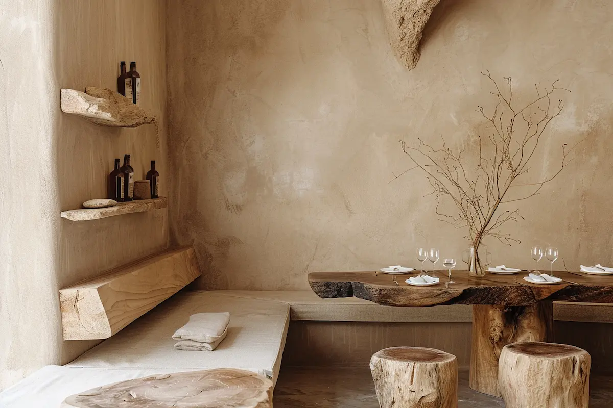
For a closer look at how these tones play out in a real dining setup, Crafted Minimalism Dining Areas shows several practical examples.
Bathrooms benefit from the quietest palette of all. Soft, restrained neutrals reduce visual noise in a space already filled with reflective surfaces and functional elements.
The key is continuity. Each room shifts subtly, but no palette should feel disconnected. Calm emerges when color transitions feel natural rather than designed.
Color as quiet support
In Crafted Minimalism, color is never the headline. It is the supporting structure that allows materials, light, and space to feel balanced over time. When color is chosen with restraint and tied directly to material behavior, it stops asking for attention and starts creating continuity.
The most successful palettes don’t rely on contrast or trend-driven accents. They work because they repeat gently, shift subtly, and remain readable from morning to evening. Warm neutrals, earth tones, and muted mineral shades provide calm not by standing out, but by staying consistent.
This approach mirrors the principles behind Creating Calm Without Emptiness: calm is not achieved by removing color, but by giving it a clear role. When color supports rather than decorates, interiors feel grounded, livable, and quietly resolved — long after first impressions fade.