Why Neutral Interiors Feel Rich When Materials Do the Work
Neutral is misunderstood
Neutral colors are often dismissed as safe, empty, or uninspired. Beige is blamed for boring rooms, off-white for lacking character. But the problem is not neutrality itself — it’s how neutrality is used.
In many interiors, neutral colors are treated as a shortcut. Walls are painted a single pale shade, furniture is chosen to “blend in,” and depth is expected to appear automatically. What actually happens is the opposite: the space feels flat, static, and emotionally distant. Not calm — just unfinished.
Within Crafted Minimalism, neutral colors play a very different role. They are not meant to disappear. They are meant to hold space. Neutral tones act as a framework that allows materials, light, and texture to become visible. When chosen with intention, they create richness without noise.
True neutrality is never colorless. It lives in subtle undertones, mineral references, and material variation. Warm sand, pale clay, softened stone — these tones feel familiar because they echo the natural world. When neutral colors are understood this way, they stop being a fallback choice and become a powerful foundation for calm, character, and longevity.
Why neutrals fail when they rely on paint alone

Neutral interiors often fall flat when neutrality is reduced to a paint decision. A wall color is chosen, everything else is matched to it, and calm is expected to emerge. But paint alone cannot carry depth. Without material interaction, neutral colors lose their complexity and become static.
Paint creates a uniform surface. Even matte finishes tend to behave predictably: light hits them evenly, shadows remain shallow, and the color reads the same across large areas. This consistency might look clean, but it offers the eye very little to engage with. The result is not calm — it’s visual fatigue.
In Crafted Minimalism, neutrals gain richness through material absorption and variation. The same neutral tone behaves differently on wood grain, woven linen, porous stone, or plaster. These surfaces break color into subtle shifts, allowing light to soften and move slowly across the space.
This is why relying solely on paint often leads to disappointment. The color may be “right,” but the room still feels empty. Depth doesn’t come from adding darker accents or contrast; it comes from letting materials do the work that paint cannot.
When neutrals are anchored in material rather than applied as a surface treatment, they stop feeling decorative — and start feeling lived-in, grounded, and calm.
Depth comes from variation, not contrast
Many interiors try to create interest by introducing contrast: dark against light, rough against smooth, bold accents against neutral backgrounds. While contrast can be visually striking, it often increases tension. The eye keeps switching focus, never fully settling.
Crafted Minimalism takes a different approach. Depth is created through variation within a narrow range, not through opposition. Slight shifts in tone, warmth, and texture allow a space to feel layered without becoming busy. Think warm off-white next to soft sand, pale clay beside light stone. These differences are perceptible, but they don’t interrupt the flow of the room.
This kind of variation gives the eye somewhere to rest. Instead of jumping between extremes, perception slows down. Materials reveal themselves gradually as light changes, making the space feel richer over time rather than immediately expressive.
Contrast isn’t removed entirely—it’s softened. Texture replaces color contrast, material weight replaces visual drama. As a result, the interior gains presence without demanding attention.
In neutral interiors that feel calm and complete, nothing stands out sharply. Everything belongs. Depth comes not from what is added, but from how carefully tones are allowed to differ—quietly, intentionally, and in harmony.
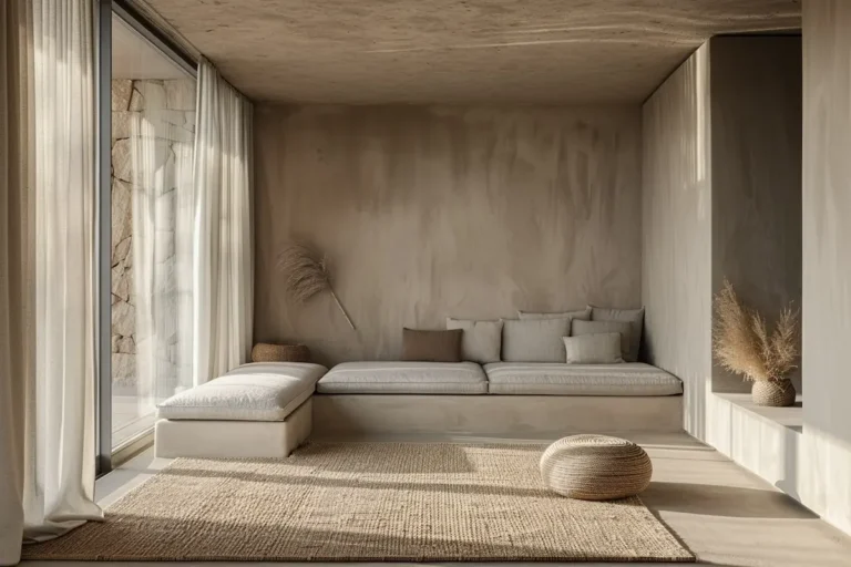
Texture is what makes neutral feel alive
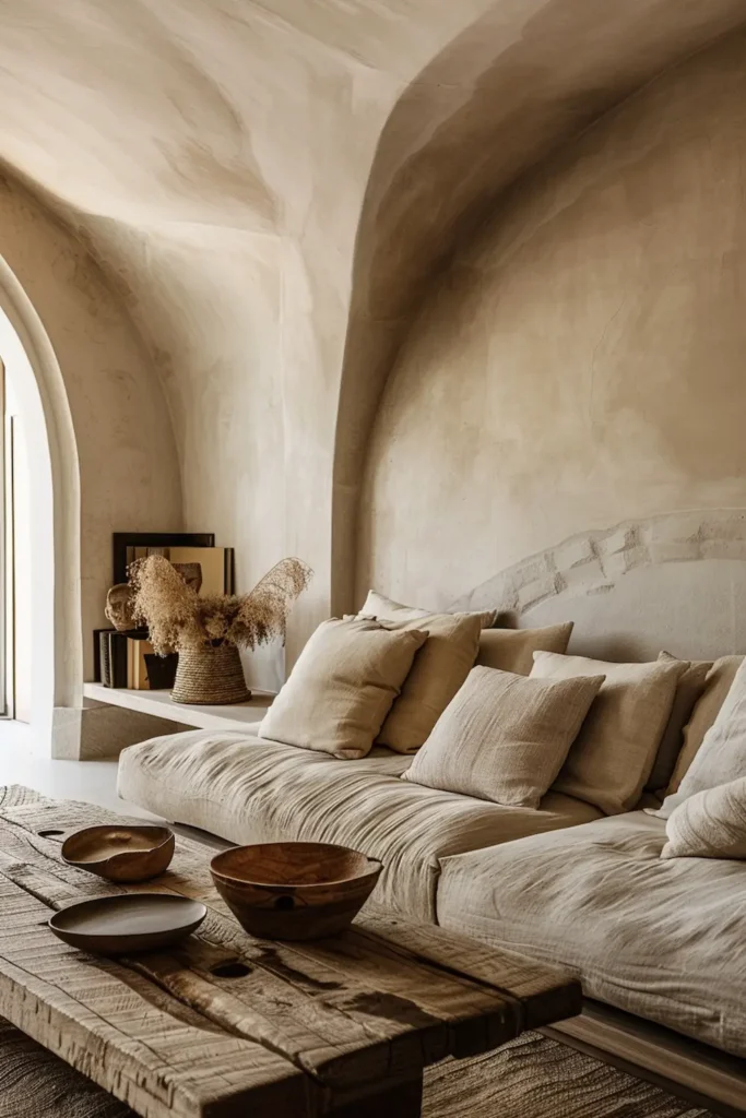
Without texture, neutral colors quickly lose their presence. A flat surface in a soft tone may look calm at first, but over time it feels lifeless. Texture is what gives neutral interiors their quiet energy. It introduces variation without adding visual noise.
In Crafted Minimalism, texture comes from the material itself. Raw wood grain, woven linen, softly honed stone, and imperfect plaster all interact with light differently. These surfaces catch shadows, absorb highlights, and change subtly throughout the day. This constant but gentle shift keeps the space engaging without ever becoming demanding.
Smooth, sealed surfaces behave differently. They reflect light evenly and reveal little variation. When too many of these surfaces are used together, neutral interiors start to feel sterile rather than calm. The eye has nowhere to pause.
Texture also affects how a space feels emotionally. Materials with visible structure signal warmth, tolerance, and use. They suggest that a space is meant to be lived in, not preserved. This is why texture often replaces color as the primary source of character in Crafted Minimalism.
Neutral palettes don’t need decoration to feel complete. They need materials that allow texture to do the talking.
My selection criteria: how I choose neutral tones that last

When I select neutral tones for a Crafted Minimalist interior, I’m not chasing versatility — I’m looking for longevity. A neutral color should feel settled not only today, but years from now, even as materials age and light conditions change.
My first criterion is undertone. I avoid neutrals with strong grey, pink, or yellow bases. These undertones tend to dominate rather than support. Instead, I look for colors that sit close to natural references: sand, limestone, unglazed clay, weathered wood. These tones adapt easily to surrounding materials without pulling focus.
Second is surface behavior. I choose neutrals that deepen rather than brighten in shadow. Colors that glow too much under artificial light quickly become tiring. Calm neutrals stay readable even in low light, allowing the room to soften in the evening instead of flattening out.
Finally, I always test neutrals in context. A color that works beautifully on linen may feel lifeless on plaster or too heavy on stone. Lasting palettes come from consistency across materials, not from finding one “perfect” shade.
This approach ensures that neutral interiors feel intentional, resilient, and quietly complete — not temporary or trend-driven.
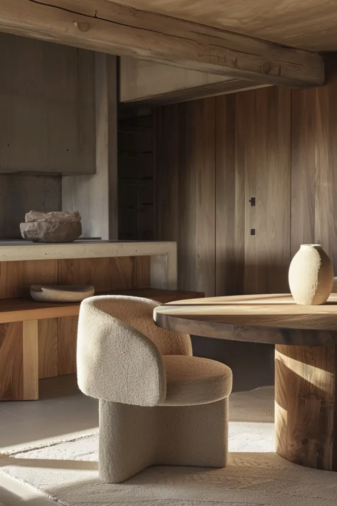
Product 1: Upholstered seating in layered neutrals
Upholstered seating is where neutral color choices become most visible — and most decisive. Large, soft surfaces amplify tone, undertone, and texture. This is why I treat seating as the anchor of a neutral palette rather than as a background element.
Layered neutrals work best here. Instead of one flat beige or grey, I look for upholstery where the tone shifts subtly through weave, fiber, and shadow. Linen and wool are especially effective because their texture naturally breaks up color, preventing the surface from feeling uniform or flat. The result is depth without contrast.
I avoid cool greys and overly clean off-whites for seating. These tones often reflect light too sharply and can feel detached from natural materials like wood or stone. Warm neutrals — soft sand, muted oatmeal, light clay — absorb light more gently and settle into the surrounding palette.
The upholstered piece I choose always feels inseparable from its color. No added tint, no visual gloss. When done right, seating doesn’t dominate the room — it stabilizes it, allowing the entire interior to feel calm, cohesive, and quietly resolved.
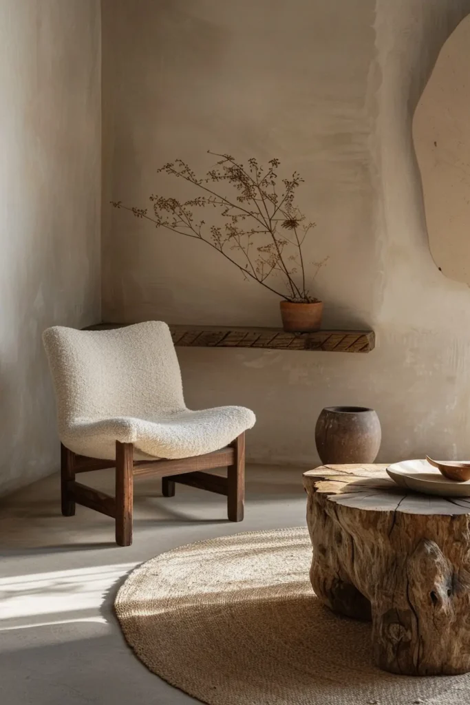
Product 2: Stone or ceramic object in soft neutral tones
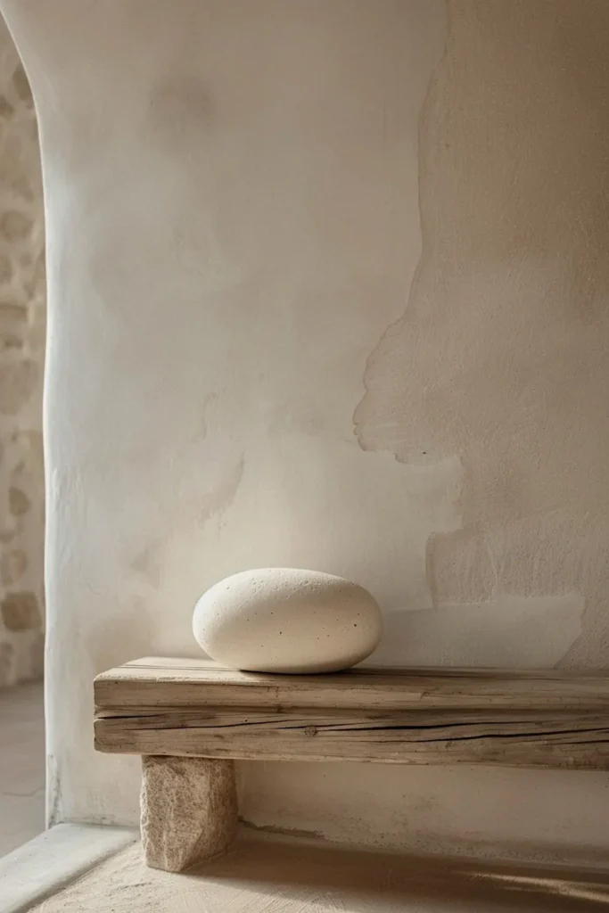
Where upholstered seating creates softness, stone and ceramic objects introduce stillness. Their role within a neutral palette is not to add comfort, but to slow the visual rhythm of a space. This is why I use them sparingly and deliberately — usually as a single, grounded element.
Soft neutral tones are essential here. Pale limestone, muted clay, light travertine, or warm mineral grey allow the object to carry weight without becoming dark or dramatic. The material should feel quiet: honed stone rather than polished, matte ceramic rather than glossy glaze. When the surface absorbs light, the object reads as calm and stable, not attention-seeking.
I choose pieces that don’t rely on shape to make their point. A low bowl, a solid side table, or a restrained vessel works because the material does the work. Placed on wood, the stone or ceramic adds balance. Placed on stone, it adds a subtle shift in texture. In both cases, it adds depth to a neutral interior without introducing “decor.”
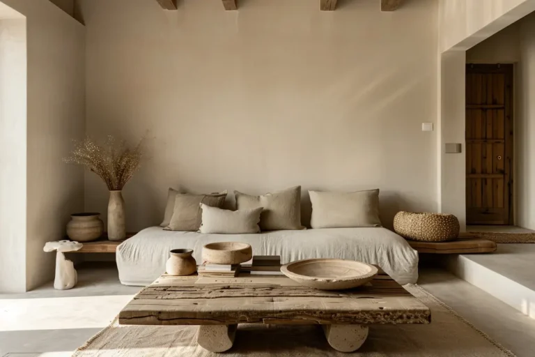
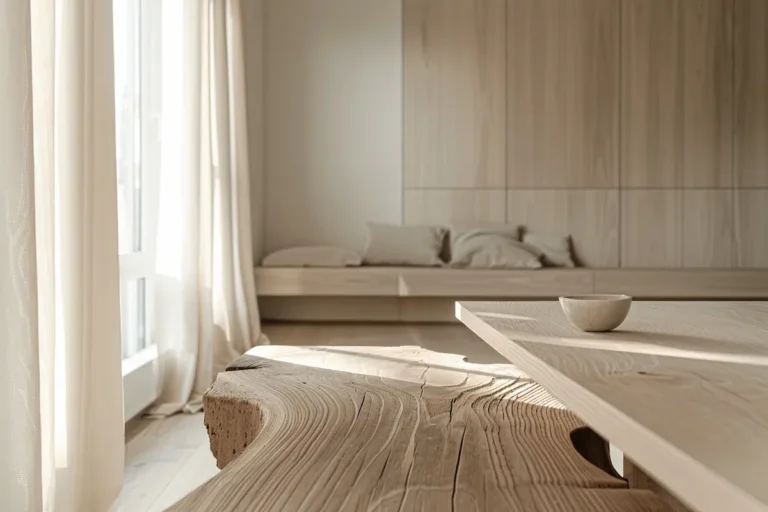
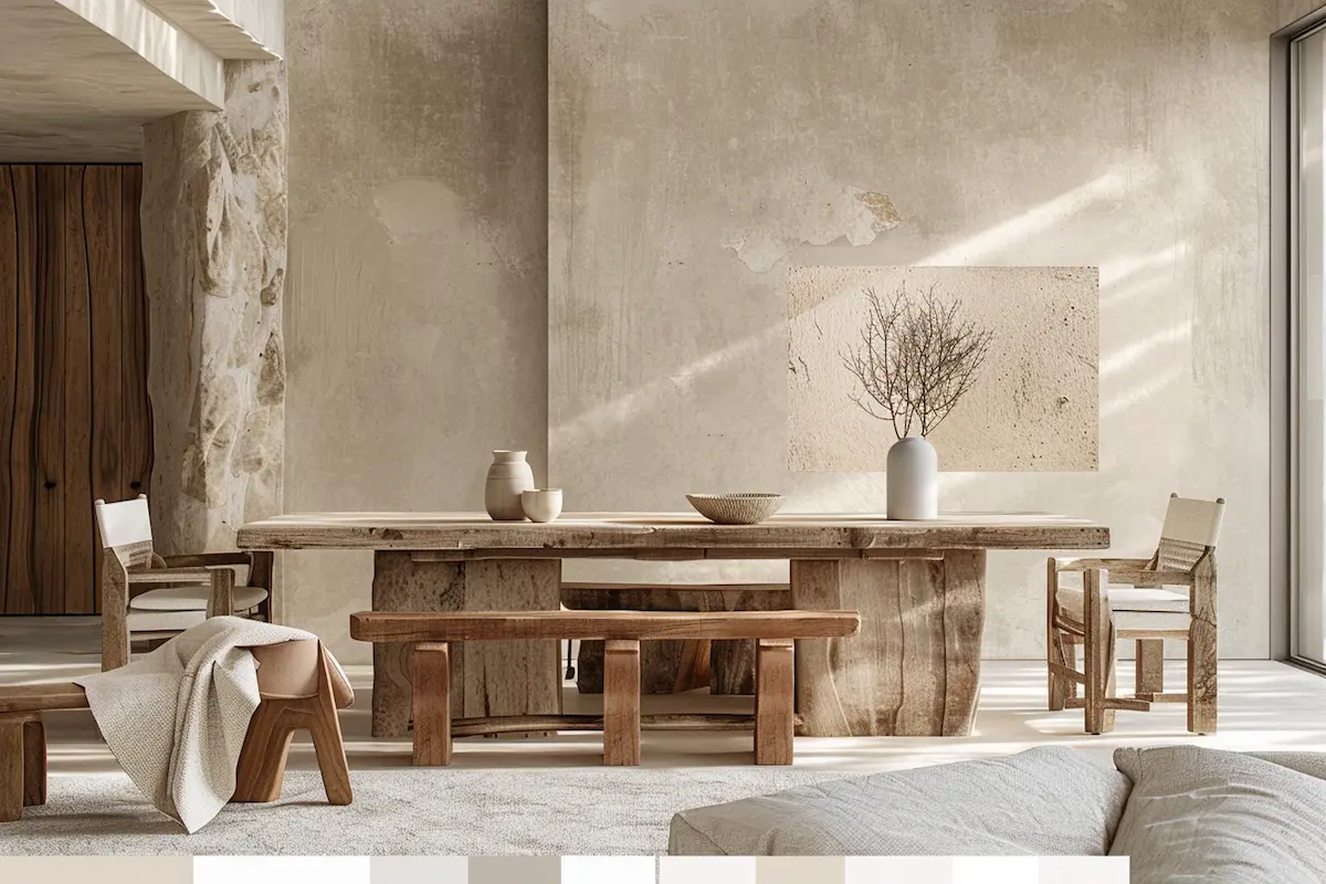
Product 3: Raw wood furniture with a neutral undertone
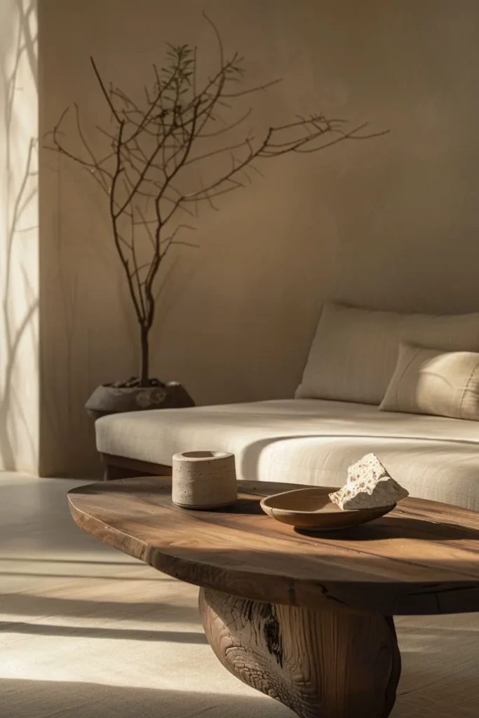
Raw wood brings neutrality without ever feeling colorless. Even the lightest wood carries undertones—honey, sand, ash—that interact subtly with surrounding materials. In Crafted Minimalism, I choose raw wood pieces where the undertone supports the palette rather than competing with it.
What matters most is restraint in finish. Light oiling or brushing preserves grain variation and prevents the surface from becoming flat. Heavy stains or glossy seals erase nuance and turn wood into a uniform color block. I look for pieces where knots, grain direction, and slight tonal shifts remain visible, allowing light to move slowly across the surface.
Raw wood furniture works best when it holds visual weight: tables, benches, shelving. These pieces ground a neutral interior by adding warmth and direction without introducing contrast. The result is depth that feels lived-in, not styled—neutrality built through material honesty rather than color design.
This reclaimed elm wood tea table adds warmth and subtle variation through visible grain, grounding a neutral palette without introducing contrast.
Product 4: Textural accent without color contrast

Not every accent needs color to stand out. In Crafted Minimalism, the most effective accents often rely on texture rather than hue. These pieces introduce interest without interrupting the palette, allowing the space to remain calm and cohesive.
I look for textural accents that sit comfortably within the existing neutral range. Think woven fibers, softly irregular ceramics, hand-finished stone, or subtly roughened wood. The color stays familiar — warm off-white, pale clay, muted sand — while the surface adds depth through touch and shadow.
What makes these accents work is restraint. They appear once, not repeatedly. A single textured object on a shelf or table gives the eye a pause without creating a focal point. Because there is no color contrast, the object feels integrated rather than decorative.
This approach allows neutral interiors to feel layered and intentional. Texture replaces color as the source of character, proving that neutrality doesn’t require embellishment to feel complete.
Common mistakes that make neutral interiors feel flat
Neutral interiors don’t become boring because of a lack of color — they become flat because of poor decisions disguised as restraint. One of the most common mistakes is relying on a single neutral tone everywhere. When walls, furniture, and objects share the same color and finish, the space loses depth and visual hierarchy.
Another frequent issue is choosing neutrals that are too cool. Greys with blue or violet undertones often drain warmth from natural materials like wood or linen, making the interior feel distant rather than calm. What looks “clean” on a sample can feel lifeless in a lived-in space.
Smoothness is another trap. Too many sealed, polished, or uniform surfaces remove texture entirely. Without texture, neutral palettes have nothing to interact with, leaving the room visually silent in the wrong way.
Finally, adding accents to “fix” neutrality often makes things worse. Contrast colors introduce tension instead of depth. Calm comes from layering materials, not from breaking the palette.
Applying neutral palettes in real homes
Neutral palettes only feel successful when they respond to how a space is actually used. Crafted Minimalism does not apply one identical neutral scheme everywhere. Instead, it adjusts tone density and material emphasis per room while keeping the overall palette coherent.
In living rooms, neutrals should feel warm and forgiving. This is where the body rests, so tones like soft sand, light clay, and warm off-white work best on larger surfaces such as walls, seating, and rugs. These colors create ease without flattening the space.
Dining areas benefit from slightly more structure. Here, neutrals with a subtle mineral or wood undertone add clarity without becoming cold. Stone, wood, and ceramic work together to ground the room visually.
Bathrooms require the quietest interpretation of neutral. Soft, restrained tones reduce visual noise in a space filled with reflective surfaces and functional elements.
Across all rooms, repetition matters more than variation. Calm emerges when tones echo gently from one space to the next, allowing transitions to feel natural rather than designed.
Neutral as a foundation, not a fallback
Neutral colors are often treated as a safe option — something chosen when stronger ideas are avoided. In Crafted Minimalism, the opposite is true. Neutral palettes are a deliberate foundation, chosen because they allow materials, light, and space to work together without friction.
When neutrals are built through variation, texture, and material honesty, they stop feeling passive. They become active supporters of calm. The space no longer relies on contrast or accent colors to feel complete. Instead, it gains depth through consistency and restraint.
This is what separates neutral interiors that feel flat from those that feel rich. It’s not about adding more, but about choosing better. Better undertones. Better surfaces. Better relationships between elements.
Neutral colors that aren’t boring don’t try to impress. They settle in quietly, age gracefully, and adapt to everyday life. When used with intention, neutrality becomes one of the most expressive tools in interior design — not because it stands out, but because it allows everything else to feel right.